I just launched my new store cuwabsport.store so i would like you all to give me a feedback about the design or anything else i can add to make it better overall.
Topic summary
A store owner launched cuwabsport.store and requested design feedback. The store sells a broad range of fitness, sports, and wellness products including smartwatches, gym equipment, athleisure, and meal prep containers.
Main Design Recommendations:
- Reduce featured collections on homepage from many to 2-3 (bestsellers/sale items) to avoid overwhelming customers
- Improve navigation with clear menus, mega nav showcasing top products, and 5-6 collection page filters
- Add hero banner with clear call-to-action like “Shop Fitness Favorites”
- Fix alignment issues with icons and improve spacing/padding throughout
- Ensure mobile optimization and page load speed
Content & Trust Issues:
- Strengthen product presentation with multiple high-quality images from different angles
- Expand product descriptions focusing on benefits, shipping, and return policies
- Add customer reviews, trust badges, and guarantees
- Create About Us section explaining brand story and values
- Make CTA buttons more prominent with consistent styling and hover effects
Technical Problems Identified:
- Missing/insufficient SEO elements (meta titles, descriptions, alt tags)
- Multiple H1 tags breaking page structure
- No analytics/dataLayer tracking setup
- Two overlapping chat widgets (Shopify Inbox + SmartBot)
- Collection page filters not functioning properly
Credibility Concerns:
- One commenter noted suspicious elements: products appear to be dropshipped, Facebook/Instagram links point to unrelated London boutique, product images copied across hundreds of sites, and unrealistic reviews (6 reviews per product, including claimed $5k purchases from unknown store)
- About page wording implies physical storefront when none exists
Branding Advice:
- Narrow niche focus (currently too broad) to something specific like “home fitness equipment” for better brand recognition
- Improve visual cohesion across site with consistent fonts, colors, and button styling
Multiple commenters offered paid services for implementing improvements.
9 Likes
Hi,
Congrats on launching your store! A few quick feedback points:
-
Homepage & Design: Make sure it’s clean and easy to navigate. Highlight your bestsellers or featured products upfront.
-
Navigation: Use clear menus and filters so customers can find products quickly.
-
Product Pages: High-quality images, detailed descriptions, and clear pricing help build trust.
-
Trust Signals: Consider adding reviews, badges, or guarantees to increase confidence.
-
Mobile Experience: Test on mobile — most traffic comes from mobile devices.
-
Speed & Performance: A fast-loading site keeps visitors from bouncing.
Small tweaks like badges, clear CTAs, and simple navigation can make a big difference.
1 Like
Looking good! Here are my suggestions:
- I can see a lot of featured collections on the home page, which might lead to lower purchases as it confuses customers! I’d suggest having only 2-3 collections on the home page - eg: best sellers or sale collections
- Optimize the navigation and see if you can showcase your top products in the mega nav! This leads to more conversions
- Branding can be more cohesive throughout the website!
- A lot of icons are out of place or are not aligned properly
- You can include about 5-6 filters on your collection pages! Helps users to find what they are looking for easily
CONGRATULATION ON YOUR NEW STORE
What’s Working Well
-
Clean theme & layout: The site feels organized and isn’t overwhelming.
-
Product variety: You’ve got a wide range of fitness, sports, and wellness gear, which gives visitors lots to explore.
Areas to Improve
1. Brand Cohesion & Niche Focus
Your product mix is quite broad (from smartwatches to meal prep containers). Narrowing your niche say, “home fitness gear” or “wearable tech for active people” can help visitors understand your brand quickly and build trust.
2. Product Presentation & Description
-
Use multiple, high-quality product photos from different angles to help customers visualize the products better.
-
Include clear, concise product descriptions with key benefits and usage ideas. Mention shipping & return info right on the product page.
3. Navigation & Hero Banner
-
Make navigation intuitive group similar products and maybe add featured collections or categories in the top menu.
-
A homepage hero section with a clear, on-brand image and concise Call-to-Action (like “Shop Fitness Favorites”) can guide visitors right to your best sellers.
4. Trust & Social Proof
-
Add an “About Us” section that tells your brand’s story why you started, your values, etc. It helps visitors connect and trust you more.
-
Showcase customer reviews or testimonials these are powerful trust-builders and can greatly boost conversions.
5. CTAs & Button Styling
-
Improve call-to-action buttons: make them stand out with hover effects and contrasting colors, so they’re easy to spot and click.
-
Keep buttons consistent (size, style, color across the site) to reinforce visual cohesion and user confidence.
6. Image Quality & Load Speed
-
Optimize images for both clarity and loading speed—this improves user experience and reduces bounce rates. High-quality visuals also make your products look more appealing.
Best,
Falex
Thank you for the feedback
1 Like
Hello @Cuwabs
I checked your site — overall it looks good, but a few points can be improved:
- SEO: Some important SEO elements are missing (titles, meta descriptions, alt tags). Optimizing them will help ranking.
- Tracking / Data Layer: Your store doesn’t seem to have proper dataLayer events set up for analytics and ads tracking. Adding these will help with performance tracking and marketing campaigns.
- Spacing & Layout: Some sections feel a bit tight — adjusting spacing/padding will improve readability and overall user experience.
- Speed Optimization: A few images are not optimized and scripts can be reduced. Improving page speed will help conversions.
- Trust Elements: Adding trust badges, clear return/refund info, and maybe customer reviews on the homepage will build more confidence.
Once you fix these, the site will look more professional and also perform better in terms of marketing and sales.
Note: If you’d like my help with these improvements, feel free to contact me at devcodersp@gmail.com.
Hi @Cuwabs
I have checked your store!
Overall, your store looks good
Here some suggestions from my view:
#1 Brand focus & niche
Your catalog is very broad (from smartwatches to fitness gear, food, and apparel). A stronger niche focus (e.g., “home fitness equipment”) will help customers remember your brand more easily.
#2 Product presentation
Add high-quality product images from different angles.
Improve product descriptions – focus on benefits, shipping details, and return policies.
#3 Navigation & visual impact
Use a hero banner on the homepage with a clear call-to-action (like “Shop Now” or “Explore Best Sellers”).
Improve your menu – group products into clear categories, add featured collections for quick access.
#4 Trust building
Add an About Us section to tell your brand story and values.
Display customer reviews, trust badges, or return guarantees to increase credibility.
#5Stronger Call-to-Action
Make CTA buttons (Add to Cart, Buy Now) stand out with consistent size, color, and maybe hover effects.emphasized text
Best
Danny from Samita Team
Hi @Cuwabs ,
I’ve reviewed your store, and it looks pretty solid overall!
Here are some suggestions that could improve your store’s performance:
#1 Product Presentation
Consider using high-quality images from various angles for each product. Additionally, improving your product descriptions by focusing on the benefits, adding shipping details, and including return policies will provide customers with more valuable information.
#2 Navigation & Visual Appeal
A hero banner on your homepage with a clear call-to-action like “Shop Now” or “Explore Best Sellers” could make a significant visual impact. You could also enhance the menu by organizing products into specific categories and adding featured collections for easier access.
#3 Brand Focus & Niche
Your product range is quite diverse, but narrowing it down to a stronger niche (e.g., “home fitness equipment”) would help make your brand more memorable and attract a more focused customer base.
#4 Building Trust
Adding an “About Us” section where you share your brand story and values will help create a connection with customers. Don’t forget to showcase customer reviews, trust badges, or return guarantees to build credibility and increase trust.
#5 Stronger Call-to-Action
Ensure your CTA buttons, like “Add to Cart” and “Buy Now,” are more noticeable by using consistent size, color, and possibly adding hover effects to draw attention.
Best,
Felix
1 Like
Hello @Cuwabs , I have evaluated each page design and its performance as well. Do not know what the issue is generating the results from the Page Insights Report, so you need to check out what the issue is coming in that. From a design perspective, your design seems good, but still some important things lacking in your store. Below are my findings for your store -
-
Navigation Bar- You have placed a navigation bar that is a good thing from the user perspective, but in desktop view, it is too small for the user to navigate. You can slightly increase the size of the text used there or the whole bar to enhance the user experience.
-
Fonts and Color - Placing the proper font and using of right match of color match is also important. You have done a good job, but in the product cards on the home page, the pricing text should be in a dark color so that it can be seen properly. The font size should also be slightly larger as it should look separated from the Product name.
-
Customer Reviews - The customer reviews section is not in your store, which will reduce to build trust among users. So if possible, you can add a customer reviews section in your store, depending on you, whether for each product or as a whole, at the bottom.
Hey @Cuwabs
I just had a look and the design feels clean and easy to navigate, which is a big win. You might want to tighten up product descriptions a bit (clearer benefits usually help conversion) and maybe add some trust signals like reviews or a FAQ section. Also, once you’re ready to push traffic, setting up an affiliate program with something like UpPromote can really help bring in steady customers without heavy ad spend. Overall, you’re off to a solid start!
Hi @Cuwabs,
I checked out your store - you’ve got some great products and overall it’s a solid start. The concept feels strong, and I can see the potential for a really engaging shopping experience with a few adjustments.
- Homepage: I’d recommend tightening up the header so it doesn’t take too much space - that way customers can see the slideshow and first banner right away without distraction. Your collection list could also look more appealing; right now, the text blocks take up too much space and feel a bit uneven. If possible, consider adding a video section for variety and motion, which can keep visitors engaged longer.
- Collection pages: I noticed the filters seem to have issues. It’s worth checking if this is a setup error. Even using the default filters from your theme could be a great option - they’re usually clean and functional.
- Product pages: The layout would benefit from being more concise and visually compelling. Adding content tabs (for details, shipping, reviews, etc.) can keep the page organized. Higher-quality images are always worth the investment, and a sticky image or add-to-cart section that scrolls alongside the content can improve usability. Small touches like these make the shopping journey smoother.
Those are the core pages that drive traffic and sales, but don’t forget your other key pages (About, Contact, Policy) since they build credibility and answer customer concerns.
Beyond design, other factors are just as important for conversions. Product quality, clear branding, and building trust with reviews, policies, and social proof all encourage buyers. SEO will help attract organic traffic over time, and marketing across multiple channels (ads, social, influencers, affiliate tools like UpPromote) can bring the right audience to your store.
Wishing you success as you refine your store - you’re off to a strong start, and with these improvements, I think you’ll see even better results!
Happy to know you have launched new store and after my further checking, I notice something unusual concerning store SEO which can be optimized in a better way. We can check together to know more details:
-
Your store has more than one H1 tag existing. Excessive H1 tag will break your page structure and let Google fail to know your main title on a page, which results in a chaos of page indexing. Please double-check if your added elements on a page contains several H1 tags and if so, remove the unnecessary ones and keep the main title only as H1 tag, this will help resolve this issue.
-
Insufficient Meta title and Meta description. I notice you have added meta title and meta description, but it is not enough after checking, as they are too short and not explained in a very clear way. You can add more information in the meta description to fulfill the details of brand or products, so that visitors can know all necessary contents directly when searching on Google. The recommended length of meta description is between 120-200 characters, please kindly note here.
-
Missing Alt texts on product images. When I detect out this issue, I feel suprised to know it, as multiple images are lack of alt texts on the website. Please do your best to add the missing ones as they affect SEO as well very much.


With a regular optimization on store page contents and SEO both, you will get more sales and better conversions in the future. Please kindly further consider the ideas I share with you or use SEOAnt to assist on store sales, which can help check store SEO status and optimize search appearance, a kind reminder here.
Hey @Cuwabs Congratulations on launching cuwabsport.store! I just had a look, and overall the design feels very clean, modern, and easy to navigate - which is a big win, especially for first-time visitors.
Here are a few thoughts that might help take the store to the next level:
-
Product descriptions: Consider tightening them up a bit and focusing on clear benefits. Highlighting what makes each product unique or how it solves a problem for your customers usually improves conversion.
-
Trust signals: Adding customer reviews, testimonials, or a FAQ section can help reassure visitors and encourage them to buy.
-
Visual hierarchy: Your images are great, but consistent sizing and perhaps a few lifestyle shots showing products in use could make the pages more engaging.
-
Call-to-action clarity: Make sure buttons like “Add to Cart” or “Buy Now” are very visible and consistent across all product pages.
-
Marketing boost: Once you’re ready to push traffic, consider an affiliate program with something like UpPromote — it’s a great way to bring in steady customers without heavy ad spend.
I’ve also built fitness and supplement stores in the past - you can check one here: The Fitness Group Canada (PW: yohnti) to see my work.
If you want help with SEO, increasing conversions, or general Shopify optimization, I’m available anytime. You can also see more of my past projects here: rajatweb.dev, where you can get my contact info as well.
Overall, you’re off to a solid start, and with a few tweaks, the store could perform even better. Keep up the great work!
Best regards,
Rajat | Shopify Expert
Honesty is always best. I admire that you put your Canada apartment address in your policies. However, the wording in your About page implies that you have an actual storefront and you stock the shelves. Your Facebook and Instagram links are apparently of pages from a boutique in London, and the website link in the Facebook page is no longer a valid website. Product images are downloaded and copied to hundreds of websites. People can overlook seemingly small discrepancies, but when they add up, it creates suspicion. At a glance, I’d guess you are subscribed to Shopify’s dropshipping apps and you don’t actually have the products you offer. I highly advise against this method of commerce. Not only is it dishonest to your customers, but the dropshipping market is beyond saturated.
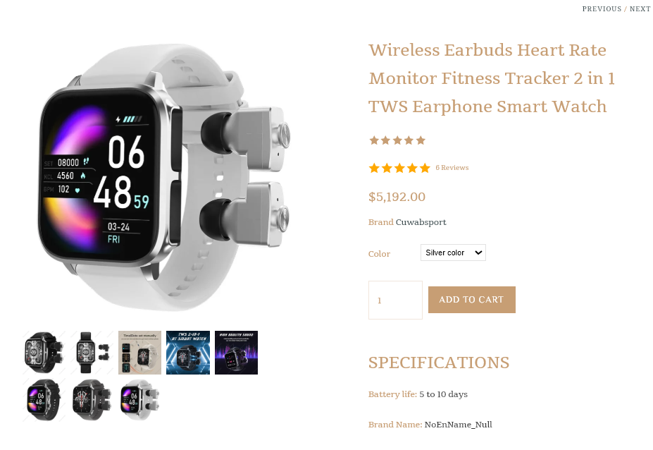
Additionally, virtually every one of the products has exactly 6 reviews. Look at this product, its price, and the reviews. According to your website, 6 people went to an unknown site and made a 5k purchase. I do not believe that at all. Not even 1 person has done so. I think this is by bar the best example of what not to do when building out a website.
Hey,
I checked out your store, and I think you’ve got a solid base with great product images and a clean layout. That said, there are a few areas you could tweak to boost sales and make the shopping experience smoother.
First, work on SEO a bit. Things like meta titles, descriptions, and headings could be improved, which will help your site show up more in search results and bring in organic traffic. Right now, it seems like there’s a missed opportunity to get found by people searching for your products.
Another thing I noticed is that while you have different product categories like gym products, sports games, athleisure, and winter essentials, there’s no upselling or cross-selling happening. This is an easy win. For instance, if someone is buying a gym product, you can recommend accessories or matching items, it just makes sense. Even bundling related items, like a set of athleisure, could help customers get more value and you get a bigger sale.
Also, adding a sticky add-to-cart button and a progress bar showing how far they are from getting free shipping or a discount would make the experience much smoother. This type of stuff keeps people engaged without feeling like they need to leave the page.
For adding these types of features, you might want to look into tools that can make it easy, like iCart. It’s an option that helps with upselling and improving the cart experience, especially for stores that want to make these kinds of tweaks quickly and without a lot of fuss.
Overall, with a little SEO love and some tweaks to upselling and the checkout experience, your store is set up to convert even better. Hope this helps, and best of luck with your store!
Hello @Cuwabs,
I checked your store and noticed one issue with the window – you currently have two chat widgets overlapping each other. One is from Shopify Inbox, and the other seems to be from SmartBot: Leading AI Chatbot.
Since both are showing up together, they overlap and affect the user experience. I’d recommend keeping only one of them active, whichever you prefer, and removing the other. This will make your store look cleaner and improve usability for visitors.
