Super Low Conversion Rate

Hey everyone!

I’m looking for some feedback, anything is welcomed, I’ve been trying to increase my traffic and sales, and conversion rate is just not right, it’s been dropping or stagnant at a very low 0.27% in the last 12 months.

Data shows as following: 1.98% added to cart, 2,04% reached checkout and 0.27% completed checkout.

I’m pretty sure my traffic is good so I don’t really think that’s the problem here, because most traffic I get is organic and comes from google, my website is a sneaker shop, so people search directly for these models and they end up not buying so I think something within my website.

Prices are competitive with other sneaker websites, and I offer free shipping in local and nearby country, and ship worlwide.

The website is hypedfam.com, if any of you want to take a look.

Website is available in spanish, portuguese and english.

Would really love any feedback.

Hi @luis14oliveira

Welcome to the community and great job on the store. It is very clean and good-looking shop. Also good speed and some interesting theme details like a button for going to the top that fills the border as you scroll down. I am not sure of all the things that could influence a drop in conversation but I could give you a few things that I noticed as a customer.

First, the header, is great in that it takes up a small amount of space but for me, a font size of 12px is too small for anything. Even 16px looks fine. Hero banner is too big for me, too much space it takes even those images are a great choice. The Shop Now button not too noticeable and not sure why it leads to the Black Friday collection. That passed a long ago :slightly_smiling_face: After that a scroll text, again for me too small plus moving, could be hard to read to a lot of people. The featured collection is well placed butt could be bigger to fill the container and a bit more space between. The rest is fine but maybe the footer needs some work and more links.

The product page, below the title and price, could be 2-3 more icons/text to reassure customers. For the size dropdown, there is a bug, asthe opened options go below other text:

And sorry to ask, but could you explain how size 40 can be 190 and size 41.5 450 ? But also in general do you have all those sizes available? I feel maybe radio button group with squares for each size could be a better solution. You see all options straight away but maybe it would not look so clean when there are too many options.

One thing I check always is contact information and for your site, I could find just an email. That is not enough to trust you, usually business name, registration number, address, and phone are expected.

Good luck and I am sure other people will give more feedback.

Hello!

Thank you so much for your feedback, there’s definitely some nice suggestions that I’ll take and do some changes, like font size, the shop now and the collection it leads to.

I didn’t really understand the ‘after that scroll text’, if you could explain, I’ll also add some icons sounds like good suggestion, regarding the dropdown, it’s not perfect, needs a fix but i find it hard with this theme, I’ll still see what I can do.

Regardin price changes on different prices, I forgot to mention the sneaker shop is a resell shop, so it really depends on market prices and availability, I know it’s not the usual shop but that’s how sneaker resell shops operate, sometimes differences on size are really big.

Contact information is also a great tip will take care of that now.

But even with all these, I have a feeling this problem has a deeper cause, I find 0.27% ridiculously low, but every increase on it will help thats for sure.

Thank you so so much for taking your time.

1 Like

Thank you for explanation that it is a resell shop, makes sense but also it is good to have prices like that so no surprises for customers later.

For scrolling text, sorry was not precise, marquee text with icons just below hero images "Serviço ao cliente dedicado 14 dias para devoluções

Portes de envio gratuitos" and so on. That one is also 12px.

Yes and I do not feel all I mentioned is main cause. You should try to run some service to record user sessions like Microsoft Clarity or Lucky Orange to see general customer behaivor and why they might leave checkout. To me chalput is good, a lot of payment options.

Forget to mention, on the product page you would need some review app, some real user stories, videos are the best if possible. Also maybe a section or two more, again for credibility and reassurance of customers.

Hope it get better.

I checked the website and noticed a few issues that might be causing low conversion rates. I conducted an audit to examine these issues in detail. Please take a look and let me know if you have any questions. https://drive.google.com/file/d/1topJMvD2NFFoG4c_CplQSkZUgTzaUMmv/view?usp=sharing

Hi @luis14oliveira ,

This is Kate from PageFly - Shopify Advanced Page Builder app.

I’m genuinely impressed with your website. It has a stylish flair while remaining clean, clear, and professional. Based on my expertise in CRO, I’d love to offer some suggestions to improve the conversion rate and sales for your store.

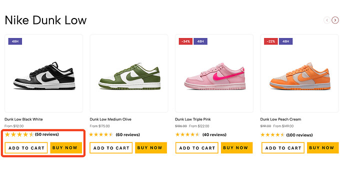
Add a title for the product list

You should add a title such as FLASH SALE, HOT SALE, or collection name,… to instantly grab attention and provide customers with a clear idea of the promotion or product category. This helps drive engagement and boosts conversions.

Modify your product display

You should display star ratings and the number of reviews to build trust and credibility with potential customers. Social proof reassures shoppers about product quality and increases the likelihood of conversions.

Include a clear Call-to-Action (CTA) button like “Add to Cart” or “Buy Now” to make the purchasing process seamless and encourage customers to take action. A well-placed CTA increases engagement and boosts conversion rates.

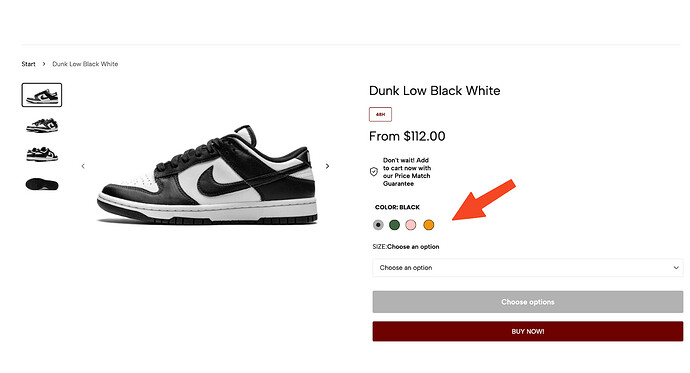
Use Color Swatches

For products available in multiple colors, it’s best to use color swatches on your product page rather than listing each color as a separate product. This keeps your store organized and enhances the shopping experience by allowing customers to view all color options in one place.

For your product list, for example structure it as a Nike Collection with Product like Nike Dunk Low, Nike Air Force 1, and Nike Air Max 1. This setup makes it easier for customers to browse different styles and quickly find their preferred color options within each category.

Have a Size Guide

You should place the size guide next to the size selection or directly below it to help customers quickly find the right fit. This reduces hesitation, improves the shopping experience, and speeds up the checkout process.

Checkout Process

  • Streamlined Checkout: Ensure the checkout process is smooth, with as few steps as possible. Offering guest checkout and multiple payment options can reduce friction.
  • Cart Abandonment: Implement reminders for users who abandon their carts, using email or SMS campaigns.

I hope you find these suggestions helpful in optimizing your website’s conversion rate and sales. If you have any further questions or need additional assistance, please don’t hesitate to reach out. I wish you the best of luck with your online venture.

Best regards,

Kate | PageFly Team

Hi @luis14oliveira

Thanks for reaching out to the Shopify Community! I’m Donna from MooseDesk , your go-to Live Chat, WhatsApp and FAQ App here to help you enhance your customer support experience.

I can tell you have put a lot of effort into building this. Here are some of my recommendations for better customer experience, please kindly check :wink:

1. Optimize your hero image

To make your hero image more engaging, consider featuring seasonal promotions, limited-time offers, or eye-catching visuals tied to special events. For example, if you’re running a sale, a banner with text like “Summer Sale - Save 30%” paired with vibrant, relevant imagery will grab attention.

This not only entices customers but also creates a sense of urgency and curiosity about what’s next. Always aim to align your hero image with the vibe of your current campaigns.

2. Add sections in the navigation bar

  • Add an ‘About Us’ Section:

Introducing an “About Us” section on your homepage can help build an emotional connection with customers and establish trust. Linking to a more detailed “About Us” page can also increase engagement time.

  • Add “Track Order” Section

As a customer, I might be confused about where to track my order on your website. To improve the experience, I suggest adding a “Track My Order” section in the main navigation.

This would make it much easier for customers to locate and track their orders, ultimately improving their connection with your store and increasing engagement.

  • Add “New arrivals” Section

We recommend adding a ‘New Arrivals’ section to the navigation bar. This would allow customers to easily discover the latest products and keep them engaged with your store. It also helps create excitement around fresh offerings, potentially boosting conversions and encouraging repeat visits.

3. Add Customer Reviews at each Product Page

Instead of just placing general feedback on the homepage, adding “Customer Feedback” on each product page will help potential buyers make more informed decisions.

For a sneaker store, seeing specific reviews about fit, comfort, durability, and style can significantly influence a customer’s purchase. This real-world insight reassures shoppers that the shoes meet their expectations and reduces uncertainty, leading to higher conversion rates and a more personalized shopping experience.

4. Add a live chat support

I can see you already have a Live chat on your store. How about making your live chat more powerful to help you assist potential customers instantly, addressing their questions or concerns in real time. This can prevent abandonment and encourage purchases.

I suggest exploring MooseDesk, a free Live Chat, WhatsApp & FAQ App. MooseDesk provides auto-reply features during non-business hours, a proactive help center, and a user-friendly widget layout, offering an effective solution to enhance customer support on your platform.

—————

As an expert/enthusiast in UX, I recommend implementing these changes to improve customer experience when scrolling through your store.

If this is helpful for you, please let me know by giving me a ‘LIKE’. If your question is answered please mark this as 'SOLUTION’.

Thank you for reading. Wish you a nice day ahead!

Hi @luis14oliveira

I just took a look at your store and I really like how it’s laid out! The navigation is smooth, and the design is both elegant and clean. I can tell you’ve put a lot of thought into it. As for the conversion rate issue, I have a few suggestions that could help:

1. Checkout Optimization
I noticed a big drop in your funnel from “reach checkout” (2.04%) to “complete checkout” (0.27%), which usually points to checkout issues. Do you have clear refund policies, secure payment badges, and customer reviews/testimonials displayed on the checkout page? I didn’t spot any reviews or secure payment badges when I checked. Adding those might help reassure customers and improve conversions.

2. Add a Size Guide
Since you’re selling shoes, a size guide is a must. This could help customers find the right fit without having to reach out to customer support—saving them time and reducing cart abandonment.

3. SMS & Email Marketing
Setting up an automated flow for abandoned carts could really help you recapture those sales. Sending reminder emails or SMS notifications to customers who’ve left items in their carts can give them that extra nudge to complete the purchase.

4. Site Speed
If your site is slow, you might lose customers before they complete their purchase. I recommend testing it with Google PageSpeed Insights and making sure your mobile experience is smooth. Sneaker shoppers often browse on their phones, so the mobile site needs to be seamless.

5. Social Proof & Urgency

  • Reviews: Are there enough customer reviews on your product pages? Maybe consider adding user-generated content like Instagram photos from buyers to boost trust.
  • Urgency & Scarcity: Adding things like “Only 3 left!” or countdown timers for limited-time discounts can create a sense of urgency and encourage faster buying decisions.

6. Traffic Quality
Even though you mentioned traffic isn’t an issue, it’s worth checking:

  • Bounce Rate: If it’s high, visitors may not be finding what they expect when they land on your site.
  • Geo-data: Are your visitors mostly from countries you actually ship to?
  • Session Duration: Are they spending enough time browsing your products, or bouncing quickly?

I hope these tips help improve your conversion rate!

Best,

Daisy

Hi there Luis @luis14oliveira I suggest that you set up sections for best sellers and latest arrivals on the homepage. It will help to set apart certain products from the rest.
You should set up a section for FAQs on the homepage. This would help provide answers to questions a visiting customer would likely have when they visit your store.