Did you know? In Q4 of 2024, the Shop app nearly reached $100 million in GMV in a single month. I can totally resonate with the handy mobile shopping, as I personally make most of my shopping on my cellphone.
This week, we want to hear from you about:
How do you optimize your store for mobile shoppers?
Whether it’s enhancing speed, improving navigation, or implementing responsive design, share your tips and experiences!
Understand how themes work sets you up for a great start. Check this out:
What I look out for is the balance between vertical and horizonal space. Most users do not want to land on a homepage where there is a lot of vertical scrolling with several products. I try to divide my sections into 1 swipe vertically (typically taking up about 80% vh showing the next section slightly). Whatever that can not fit into that section vertically, I make the rest of the section horizontal swipe and usually limit this to about 5 to 6 swipes. Almost everything else I could mention would be applicable for both mobile and desktop. Most of Shopify themes already design the elements with this in mind so there isn’t a whole lot of customizations that need to be done to achieve this. It also seems there has been improvements to the themes in terms of speed. I used to need to manually lazy-load some elements, and now I am hitting pretty high speeds with next to no improvements needed. So for speed I honestly just make sure the first content paint is solidly fast and move on.
For me, two key factors play a crucial role in optimizing store performance:
Your store should use a theme that is optimized for speed and efficiency.
Minimizing third-party apps and additional JavaScripts is essential. Each extra app or script increases the number of requests, which can slow down your site.
To measure and improve performance, focus on key metrics like:
Largest Contentful Paint (LCP) – Measures how fast the main content loads.
Cumulative Layout Shift (CLS) – Ensures a stable layout without unexpected shifts.
Interaction to Next Paint (INP) – Tracks responsiveness and user interactions.
One of the biggest challenges is optimizing speed on mobile devices. Mobile speed scores are often lower than desktop due to:
Slower processors on mobile devices.
Device-specific CSS rules for resizing images and adjusting viewport sizes. To address this, use separate, optimally sized images for mobile and desktop to enhance loading speed.
That said, with widespread 4G and 5G networks, mobile loading speeds have significantly improved, so this is becoming less of a concern. Still, optimizing your store for mobile users is always a smart move
When it comes to mobile optimisation, always remember—most people are scrolling, not clicking. The human attention span is short, and patience is even shorter. So, here’s what I’d focus on:
Speed – If a page takes longer than a few seconds to load, people bounce. Keep images lightweight, you can use Shopify’s built-in speed reports to stay on top of it.
Brain dead simple navigation – On mobile, people don’t want to hunt for what they need. Add a super-clear search bar, and make sure buttons are big enough to tap easily.
Effortless checkout – If a customer has to type too much or gets hit with an unexpected step, they’re gone.Enable auto-fill, multiple payment options (Shop Pay, PayPal, Apple Pay), and keep the whole process as few clicks as possible.
Test like a customer – Regularly check your store on my own phone. If anything feels annoying or slow, fix it.
At the end of the day, mobile shoppers are impatient—but if we make it easy for them, they’ll stick around and buy.
@abuislam Agreed on the pop-ups! We only have that much of space on a hand-held screen, and pop-ups must have a legit reason to grab or distract our attention.
@Alexis-Kefi The scrolling but not clicking is very relatable That said, I personally love buttons, and it’s just hard to say no to a well-designed button that match the voice of the website!
The idea of use vertical and horizontal scrolling is kind of cool - making the screen space work for shoppers’ experience. I find that people from different age groups or on different OS have their own interpretation about the swiping gesture. It’s always a nice learning from users’ experiences and how they search what they want on their mobile devices.
Totally agree, Jason!
Designed well, a button can make all the difference—clear, clickable, on-brand.
Any favourites you have come across that accomplish this brilliantly?
I’m glad you asked! I could go on for ages, but here are a couple of my biased picks.
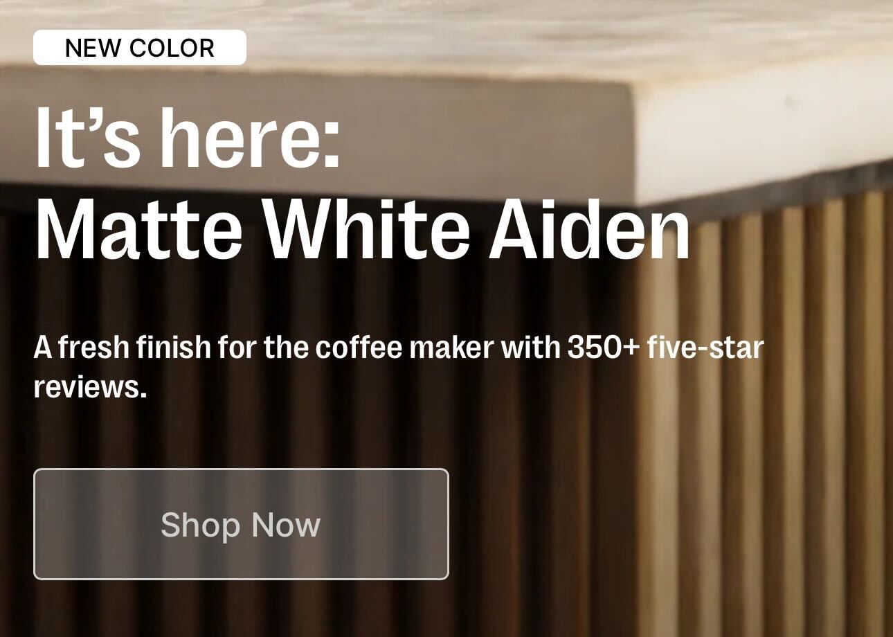
Fellow has just released their Matte White Aiden coffee maker. This new color edition is kind of good on the eyes, and their ‘Shop Now’ button echoes that sleek Matte White finish. What’s really neat is that when you tap on the button, it turns transparent, almost like it’s saying, “I hear you!” What a delightful little nudge there!
As far as responsive buttons go, DrDrone have taken a fresh approach by expanding them to their hero images. They basically showcase their products with full-paged images and make it clickable pretty much every single pixel of the given screen space. You really can’t escape the urge to click through and learn about what their products are capable of!
Thanks for sharing, Jason! Loved your insights—Fellow’s transparent button effect is such a smooth touch - I think it’s those interactive elements that make things so interesting for the user!
DrDrone’s full-screen hero images really make mobile browsing effortless.
It’s amazing how thoughtful design choices like these can make mobile shopping so seamless.
Do you think minimalism in design plays a big role in encouraging clicks, or is it more about functionality over form?
 Understand how themes work sets you up for a great start. Check this out:
 That said, I personally love buttons, and it’s just hard to say no to a well-designed button that match the voice of the website!
