Please check my Store https://Marche-electro.fr i paid alot for abos in different apps and puted some money in Adds i get like a few thousand clicks a day from them but no sales i really would like to change that maybe you could give me some information or feedback what i need to change to make first sales
Hello,
I am San from MS Web Designer.
Please share the Store URL correctly as it is not working.
If you have any concern, please let me know.
Regards,
San
Hi @Leroy7 ,
Thanks for reaching out to the community. This is**MooseDesk - Customer Support Helpdesk/FAQ App.**
Congrats on your new store! Your store looks stunning. I can tell you have put a lot of effort into building this. However, I have some comments to make the good get even better. Here are some of my recommendations for better customer experience, please kindly check.
1. Promotions Placement
I suggest strategically placing promotions throughout the website using banners or a prominent section on the homepage. The current placement may not capture users’ attention effectively, and they might overlook or dismiss the promotions easily.
2. Navigation Menu
Organize your products in the navigation menu with clear hierarchy to help users find what they need quickly. Clear categories and subcategories streamline the browsing experience, saving customers from scrolling through long collection pages.
Here is an example for you:
3. Homepage
3.1. Hero Banner
Adding a compelling hero banner with a clear description is crucial, as it’s the first thing customers encounter on your website. A captivating banner instantly communicates what you offer, while an engaging description encourages visitors to explore further.
Here is an example for you:
3.2. Product Line Introduction
Introducing a dedicated section to showcase your product lines offers users a comprehensive overview of your offerings, helping them quickly identify products of interest and streamlining the browsing experience, potentially leading to higher conversion rates.
You can follow this example:

3.3. Product Benefits Section
Create a section to highlight the benefits of your products, such as free shipping or unique advantages. This not only sets you apart from competitors but also encourages customers to make a purchase.
3.4. About Us Section
Adding an “About Us” section is crucial for building trust and credibility with visitors. By sharing your brand’s story, mission, and values, you make your store more relatable and deepen the emotional bond with potential customers.
3.5. Reviews/Testimonials Section
Adding a section for real customer reviews boosts transparency and builds trust in your brand. Positive feedback acts as strong evidence, guiding potential buyers’ decisions and making them trust your brand more.
Here is an example for you:

3.6. Strategic Call-to-Action Placement
Strategically placing call-to-action (CTA) buttons across the homepage is essential for guiding users towards product pages and facilitating seamless navigation. Thoughtfully crafted CTAs prompt action and drive conversions, contributing to an improved user journey. You can read this article to more information.
4. Footer
Revamping the footer to include important store info like contact details (email, phone) and location strengthens your store’s credibility and accessibility. This makes visitors feel more confident, knowing they can rely on your support and service.
Here is an example for you:

5. Catalog Page
Organizing the catalog into clearly defined sections enhances user experience by simplifying product discovery. By categorizing products based on specific criteria, you help users to find relevant items efficiently, promoting engagement and satisfaction.
You can follow this example:

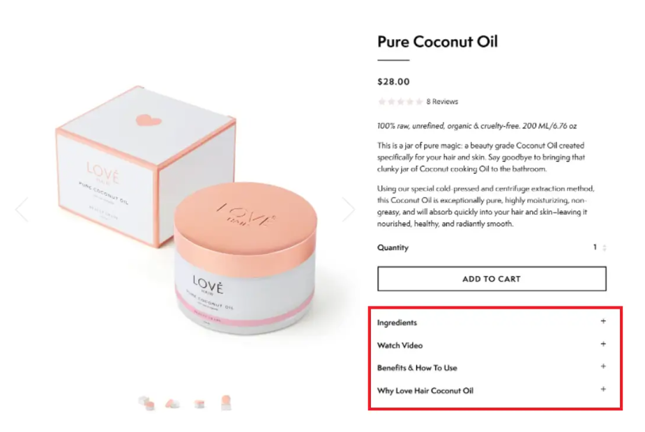
6. Product Page
Improve product pages by breaking down descriptions into easy-to-read sections and offering detailed specifications. This helps users make smart buying choices independently, making the shopping process smoother and less complicated.
Here is an example for you:
7. Support System and FAQ Page
Implementing a contact support system and FAQ page serves to address customer queries and concerns proactively. By providing comprehensive assistance and valuable information, you foster trust and loyalty among users, nurturing long-term relationships.
To address this, I recommend using MooseDesk, an app for creating unique FAQ pages for your customers. Besides helping you creating your FAQ page, we also provide a helpdesk/ticketing system for your customer support.
Great news, we also have Contact us template so you can customize your page too!
Since our app is now available for free, all current users will be considered as early-bird users and get to enjoy all our current features for free forever!
As an expert/enthusiast in UX, I recommend implementing these changes to improve customer experience when scrolling through your store.
If this is helpful for you, please let me know by giving me a ‘LIKE’. If your question is answered, please mark this as 'SOLUTION’.
Thank you,
MooseDesk - Customer Support Helpdesk/FAQ app
Hi @Leroy7 ,
It’s Kate here from PageFly, a Shopify Landing Page Builder app. As a website builder and a CRO expert, I have some suggestions for optimizing your store.
HOMEPAGE
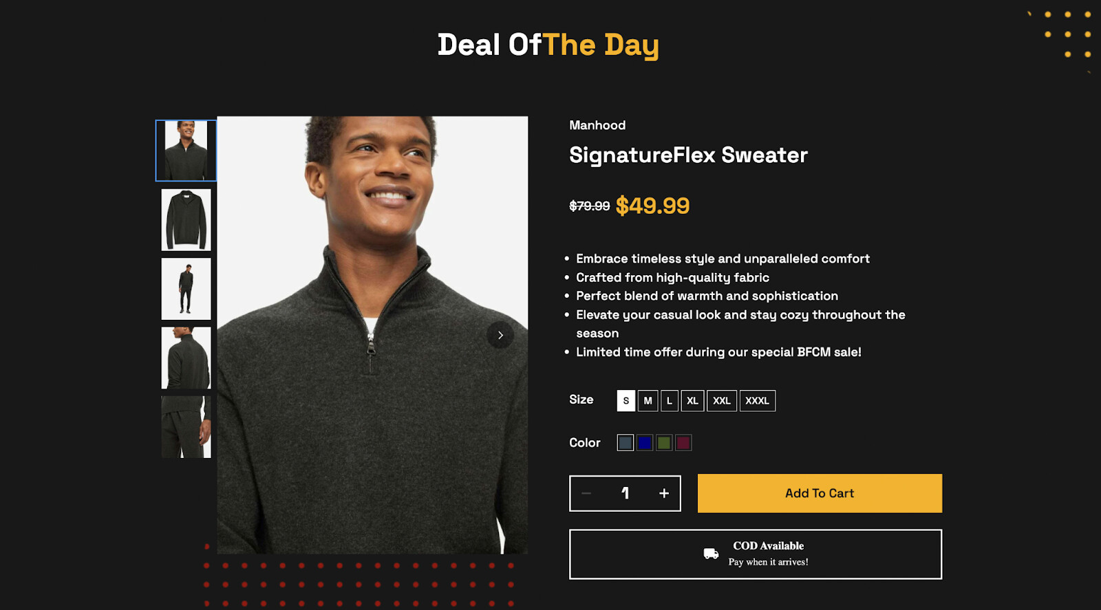
1. Add a hero banner to your store. It should be an image of your leading product(s)

2. Optimize the title: “Browse our latest products”. It’s too general. Try to focus on a product category
3. Create product collections. If you have many products, then I’d like to suggest grouping them into relevant collections. This way, it will be much easier for visitors to navigate and understand what types of products you’re selling.

For examples:

4. Create a product spotlight section. Pick one leading product or a group of them to highlight on your homepage. For example:
- Product list:

- Related products section:


- Featured product:
5. Add a favicon logo to your store. It builds trust and creates a sense of credibility.

PRODUCT PAGE
1. Add a size guide. So visitors can quickly picture the size of the products without reaching out for support.

2. The review section is duplicated. Please check.

- If you’re dropshipping, you can add some reviews app to import reviews directly from the original platform. You can explore them in the Shopify app store.
I hope these tips will enhance your store and boost conversion rates. I wish you the best in your endeavors. Keep up the great work!
Cheers,
Kate | PageFly team