No conversion. No sales. www.sosavvyboutique.com - Please help
Hi @JHolder
No conversion and no sales. But also, you did not provide any info on what you are trying for marketing or social media. How long is your store up?
Also, have you searched for similar topics, there are maybe thousands of similar topics with no sales title. And a lot of good advice in them.
But I can give you a quick review of things I noticed.
Homepage:
- Color choice is good, pink and white look good, elegant font also
- Maybe think of some logo, but also you would need a favicon
- The first announcement bar should be enough, but you should add links to any text, to lead customers to some pages
- The second one is extra and just takes important space, you can move free shipping text to text slider above and follow us next to social icons
- The main menu could be organized better, you do not need policies there but could maybe add more links like shop by price, occasion, or similar.
- A hero image is just fine, but the text needs to be more than just welcome, it needs to engage customers more
- Featured products, well images need to be the same size this looks messy. Also, the product title font size is too small 10px, it is a bit of a struggle to read and you need to make them memorable enough for customers
- Marquee slider text should be white, that is more contrast
- Shop the look is good
- Think you would need some content about your brand next, not some chat GTP fake text about vision and world peace
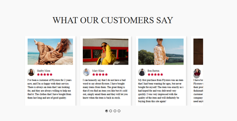
- Also, some real reviews would be good to have there, video ones are the best but text is fine too.
- The footer, again base body font seems too small.
Collection page:
- Not bad in general
- Need more text, and collection description, you need to give some food for search engines
- And again, images need to be the same sizes
Product page:
- My first thought is, that this is too narrow and too much white space at the top
- Breadcrumb should be one line, the Product title in two if possible, and Sizes in one line if there are just 3. Really too narrow.
- Personally I do not like white outlined, but your is visible enough. Still it is not that dominant next to that accent color background, ShopPay button
- Some products have just a few lines of text, you can use Shopify AI to generate some more text
- A size guide is a must
- You could use more sections, like icon/text grid of 4 with some main features for customer reassurance
- A review app
- If available product video also is a plus
- You could add “Shop the look” here also for some products, maybe some bundles, discounts
- You have a blank section with “Some HTML content”
You should have clear contact information, like business name, address, phone and email, I did find all in 2 policies but it should be in one place easily for customers to find. Some are on the contact page, and some are in the footer.
In general a solid store but these small things could be improved.
Good luck with sales, I am sure they will come.
Hi @JHolder ,
We appreciate your inquiry in the Shopify Community. We are MooseDesk, a comprehensive Live Chat, FAQ & Helpdesk App designed to elevate your customer support experience.
Congrats on your new store! I can tell you have put a lot of effort into building this. Especially there is a pop-up window for sales boost at first along with such a diverse range of products on ‘Shop’ page
However, I have some comments to boost sales. Here are some of my recommendations for conversion improvement, please kindly check.
- Optimize pop-up window & add CTA link to Homepage banner
Your first message at the pop-up window could be more incentivizing if you add a timing countdown (20 hours:30 minutes left…). Also, leverage Social Proof and Scarcity by displaying low-stock alerts (e.g., “Only 3 left in stock!”) to create urgency and highlight recent purchases (e.g., “X people bought this in the last hour”) to encourage action.
Also, I see you put the banner “SAVE 15% WHEN YOU SUBSCRIBE TO OUR EMAIL LIST” at the top of the website, which can redirect the customer to the pop-up window with their click.

2. Optimize Hero banner
With just a glance over the hero banner, I can decide whether to continue exploring a shop or not. In my first view of your website, the first image is not attractive enough. Therefore, I recommend that you optimize Hero Banner with the most captivating image of your products along with your tagline (benefits offered to your customers) to show your brand style.

3. Complete Homepage structure
As a customer, I would say that your Homepage hasn’t offered enough information for me to build trust then to purchase, as it just shows products. Therefore, I suggest the addition of Value Proposition (to differentiate your business) - Best seller Products (to boost purchase intention) - Testimonials (this is very crucial to build trust in customers) - final CTA button
The suggested structure of your Homepage could be:
- Best seller Products (to boost purchase intention)
- Value Proposition (Key features & Specifications) (to differentiate your business)
- Testimonials (crucial to build trust in customers)
- Final CTA button (Add “Shop now” button with discounts to boost purchases)

4. Upgrade user experience on Product page
I notice that the space at the top of Product page is so big which requires me to scroll down further to see the product image (which needs to be attractive enough first). Then, about product details, it is indeed crucial to add a size table so that customers could know whether your products fit them.
5. Add live-chat and more attractive Contact us form
I can see that your website is lacking a live chat widget feature and a contact us page to allow customers to contact you immediately, which can really bring you closer to customers by chatting and emailing, then converting them into buyers. Also, you can consider refining Contact us to get more contact from customers and then connect with them to turn them into buyers.
I suggest exploring MooseDesk, a FREE Live Chat, WhatsApp & FAQ App. You can easily reach customer support via WhatsApp, ensuring immediate assistance for inquiries. Also, the widget provide multi self-Service options such as Order tracking, Translation and FAQ section empower customers to resolve common questions on their own, reducing the need for direct support.


So those are some of my suggestions for your store as an UX expert. If this is helpful for you, please let me know by giving me a ‘LIKE’. If your question is answered please mark this as 'SOLUTION’.
Once again, keep up the fantastic work, and I wish you the best of luck in the future!
**Hii @JHolder **
First off, congratulations on your store — your boutique products are meaningful! With my experience in building 20+ of stores for merchants, we have some practical suggestions that I believe can help enhance your store.
Here are some suggestions to enhance your store:
NOTE: According to boutique products, I think your store design is not good and you are not following a conversion-optimized product page. Your product page is just simple as usual, not following the Bundle, Upsell, and Downsell feature for High Conversion and the Home page — there are not enough sections to represent your brand.
-
Optimized your branding and the Product thumbnail design.
-
Optimize your Product description with SEO. SEO !important

- Make your product page using conversion optimization(CRO). If your product page and the Home page do not represent the whole brand, it’s not getting sales.
The product is more important than the other page. You can use the Bundle, upsell, and downsell features on your product page, so it will increase your overall Conversion rate, AOV and LTV
Look at that ![]() , my client’s example of a boutique product page. You can follow the bundle and upsell features.
, my client’s example of a boutique product page. You can follow the bundle and upsell features.
4. Highlight your collections
I noticed you offer nine types of products, but the collection headings aren’t standing out, and the layout feels a bit fragmented.

5. Tell your brand story and Add an Instagram Feed
Customers buy products not just for their benefits but because they connect with the brand’s story — especially when the products have emotional significance. You can consider sharing:
- Your brand’s mission
- How you craft your products
- The inspiration behind your business

- Your marketing across the top mediums, which are SEO and social media, has to be top-notch with the right content and strategies. You may also need to expend some extra resources if required like getting paid ads on Meta and TikTok.
BOOM ![]() These are the key steps that I’m following in every client’s project. If you need further help, just reach out to me, if you are satisfied, I’ll be satisfied
These are the key steps that I’m following in every client’s project. If you need further help, just reach out to me, if you are satisfied, I’ll be satisfied ![]()
![]() and my suggestion is helpful Mark It As a Solution.
and my suggestion is helpful Mark It As a Solution.
I think you’ve done a great job! First impression, I wondered who your target audience is. Teenage girls or older woman? Now you need to promote and get influencers in your designs. Keep going!