Hi There Team,
Just wanting some feedback and help on my store. I am getting Traffic but I want to try and convert sales - Any feedback would be appreciated.
Thank you
Hi There Team,
Just wanting some feedback and help on my store. I am getting Traffic but I want to try and convert sales - Any feedback would be appreciated.
Thank you
Hey there @Defaultbusybee I’ve had a look at your store and here are a few suggestions I have on how it could be improved
You should have sections for best sellers and latest arrivals on the homepage. A lot of customers tend to jump into these two whenever they visit a store for the first time
It would be great to have a few videos in the product gallery to make the products even more appealing even though the pictures are already high quality
You should have a section for FAQs on the homepage. This would help to show what makes your stuff different from all the others in the market.
I hope you find these helpful and happy New Year!
Hi @Defaultbusybee ,
Thanks for reaching out to the community. We are MooseDesk, a comprehensive Live Chat, FAQ & Helpdesk App designed to elevate your customer support experience.
First, your store looks stunning and the product layout is very professional! It also has quite enough essential information. However, we can make it even better. Please check some of my recommendations below.
1. Add a favicon
Adding a favicon can indeed contribute to converting visitors to shoppers, although its impact might be more subtle than other elements. It helps users quickly reorient themselves if they accidentally navigate away, potentially salvaging sales
While a favicon alone isn’t likely to dramatically increase conversions, it’s part of a holistic approach to creating a professional, trustworthy, and user-friendly online store
2. Refine the footer section
The footer is often overlooked, but it’s a valuable piece that can significantly enhance user experience and boost your website’s effectiveness.
To optimize this, consider displaying contact information, including your address, phone number, and email to the footer, instead of redirecting your visitors to another page.
3. Add an FAQ page
An FAQ page serves multiple purposes such as improving customer experience, reducing customer support load and enhancing SEO. Besides, having an FAQ page can help you address common concerns and questions faster, thus reducing the barriers to purchase.
I suggest exploring MooseDesk, a free Live Chat, FAQ & Helpdesk app. MooseDesk provides auto-reply features during non-business hours, a proactive help center, and a user-friendly widget layout, offering an effective solution to enhance customer support on your platform.
————
As an expert/enthusiast in UX, I recommend implementing these changes to improve customer experience when scrolling through your store.
If this is helpful for you, please let me know by giving me a ‘LIKE’. If your question is answered please mark this as 'SOLUTION’.
Thank you for reading. Wish you a nice day ahead!
MooseDesk - All-in-one Shopify FAQ & Helpdesk App
Hi @Defaultbusybee ,
This is Kate from PageFly - Shopify Free Landing Page Builder.
I have just had a look at your store. Your store is well-organized but I would love to provide my recommendations for your store so that it may gain more sales. May it help!
1. Add favicon to your store
Having a favicon for your store will make your store unique and help customers easily recognize it.
2. Improve the hero banner
Your hero banner is visually appealing but lacks a clear, action-driven focus. While the text “Explore the Latest Products You’ll Love” sets the tone, it doesn’t guide customers to take the next step. Adding a bold and enticing call-to-action (CTA), like “Shop Now” or “Discover Collections,” would help direct users immediately. Placing the button centrally with a standout color would further improve its effectiveness. Or you can add a hover color for the button on desktop.
3. Optimize Featured product section
The featured product section showcases a variety of appealing items, but the repeated “Don’t Miss Out” labels are not only redundant but also take up valuable space. Instead, consider using dynamic labels like “Best Seller” or “Limited Stock” to build urgency and relevance. Moreover, adding quick “Add to Cart” buttons beneath each product image can simplify the purchase process. It’s also crucial to include product variants like color swatches for items with multiple colors or designs. Allowing customers to choose a variant directly on the product card before adding to the cart makes shopping more convenient and enjoyable.
4. Add Review stars for social proof
Customers often look for validation before making a purchase, and the absence of review stars under product titles and prices may be holding back conversions. Adding a visible rating system, like review stars, directly beneath the product title can increase trust and encourage purchases. This small addition immediately reassures potential buyers of product quality and reliability. Pairing this with dynamic customer reviews on product pages or near the homepage’s featured section will further boost credibility.
Or you can create a testimonials section by customer feedback. Here is an PageFly example of customer review section:
5. Enhance the navigation and page speed
The navigation bar provides comprehensive options but could benefit from more streamlined usability. Introducing dropdown menus for categories such as “Clothing” or “Accessories” can help declutter the space while maintaining accessibility. Furthermore, site speed, particularly on mobile devices, needs urgent attention. Slow-loading pages can deter shoppers, leading to a higher bounce rate. Optimize image sizes, and remove unnecessary scripts to ensure seamless browsing across devices.
In addition to building attractive and powerful pages, you should focus on marketing strategies. Let me know if you have any questions.
Good luck and have a nice day! Cheers!
Kate | PageFly team
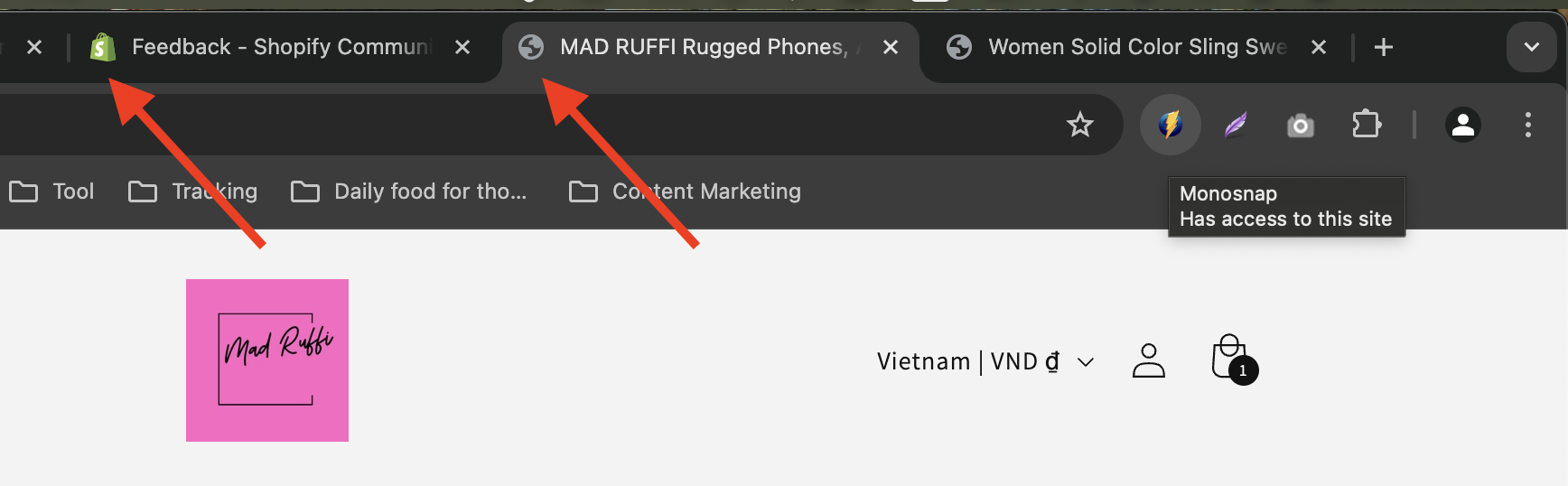
Congrats on getting traffic to your store! That’s honestly a solid first step, and it means you’ve done something right in attracting people to your site. Now, the key is figuring out what might be stopping them from buying. I checked out Mad Ruffi, and here are a few things I’d recommend tweaking or focusing on to boost those conversions:
Your homepage is like your storefront – it sets the vibe. Right now, it feels a bit simple. I’d suggest adding more visual storytelling here. Maybe use lifestyle images showing people using your products in real-life settings or highlight your bestsellers upfront. People connect with visuals, especially if they can see themselves using the product.
What makes Mad Ruffi unique? Is it the quality, the design, or the story behind the brand? Make this SUPER clear at the top of your homepage. If someone’s landing on your site for the first time, they should immediately know why they need to shop with you.
Your product pages are where the magic happens. A few pointers:
How smooth is your checkout process? Test it yourself from start to finish. If there are too many steps, if shipping rates are unclear, or if there’s anything that feels clunky, it could be turning people away. You might also want to add trust badges (e.g., secure checkout, money-back guarantee) to reassure buyers.
People buy from stores they trust. Make sure your site has:
Consider adding an exit-intent popup offering a small discount (like 10% off) if someone’s about to leave without buying. It’s a great way to nudge hesitant shoppers to complete their purchase.
Use tools like Hotjar or Shopify Analytics to see where people are dropping off. Are they bouncing on product pages? Abandoning carts? The more you know about their behavior, the easier it’ll be to make improvements.
Make sure you’re capturing emails and sending abandoned cart reminders. Sometimes people just need a little follow-up nudge to come back and buy.
From my perspective, it looks like you’re already on the right track by getting traffic. Now, it’s about tweaking and testing these things to figure out what clicks with your audience. Don’t be afraid to experiment a bit – sometimes small changes (like improving images or tweaking product descriptions) can make a massive difference.
If you need any other assistance, I am willing to help!
Best regards,
Daisy