Hello, I am new to Shopify, and I would like to know if someone can help me. I have high traffic to my store, but I am not getting any sales. I was wondering if I am doing something wrong. I know that something must be off, but I can’t put my finger on it. I am trying to get this going by myself. I am on a tight budget, so hiring someone to help me with my store is not plausible at the moment. Thank you, any feedback would be greatly appreciated.
I see this a lot. The question is do you know for certain you are getting traffic, and what kind of traffic? Is it from ads? From links? From friends? From your Facebook Page?
In your Admin page, on the left hand side, there is a tab called “Analytics”. If you click on this and scroll down to “Sessions by location”, what does it say?
1 Like
I have looked at my Analytics, and a lot of my traffic is coming from Facebook and social media pages. and there is some from Google. I have been running ads.
I have looked at my Analytics, and a lot of my traffic is coming from Facebook and social media pages. and there is some from Google. I have been running ads.
Can you share the site link?
Thank you for helping me. I really appreciate it ![]()
I had a look and I just wanted to say that overall it looks ok. There are some things you can improve on. Everything on desktop is huge. Huge pictures, Huge text, huge forms. Like I need to step back to see what is on the screen. I don’t know what theme you’re using, but mine has multiple options in the editor for the same setting, one for desktop, one for mobile, one for tablet. On mobile, your product grid looks good, 2 per row. But on desktop it’s the same, and I have a pretty big monitor so it makes each image a foot wide. It’s just too big. Can you make 4 products per row on desktop in your theme customizer? The collection pages are only 1 image per row on mobile, and 2 on desktop. The Collections List page though has 2 images per row on mobile. I suggest a standard of 2 on mobile and at least 3 on desktop.
I would add the collections to the mobile hamburger menu as well. Right now it just has “catalog”. Contact form takes up a huge portion of the screen, consider having it in 2 columns one for the form and the other for a paragraph text or image. The Labor Day image goes off of the screen. I can’t find an About Us page.
I don’t want to discourage you, it does seem like it could be something I would save for buying stuff, but right now it just looks too cluttered. Hope this helps in a constructive way.
Thank you so much, I really appreciate your feedback. I will go on and make some changes.
Where do I find the hamburger menu? When customizing the page size For Mobile and desktop top do I need to save the changes for each of them?
As for sales, no better way to start than at home and on your FB page. You could do a giveaway, and use a newsletter subscription sign up as the entry. Get a couple hundred people to sign up, and then you have email addresses to run free ad campaigns to subscribers. I’d even get some business cards with a qr code on the back for a special discount. Cold ads alone just don’t do it anymore. People are less trusting now, and we really have to put a lot of effort nowadays.
1 Like
High traffic + no sales usually means one of these:
- Traffic Quality Issue
- Are the visitors actually your target buyers, or are they just browsing from ads that aren’t well-targeted?
- Example: If you run cheap Facebook/Instagram ads, sometimes they drive clicks but not buyers.
- Trust / Credibility Issue
- New stores often lack trust signals (reviews, clear shipping policy, professional design, fast site speed).
- Customers hesitate to buy if they’re unsure whether the store is legit.
- Offer / Value Issue
- If your product pricing, photos, or descriptions aren’t strong, people leave without buying.
- Dropshipping often faces this because the same product is available cheaper on Amazon/elsewhere.
- User Experience (UX) Issue
- If checkout is confusing, shipping fees are unclear, or the site is slow, people drop off.
Note: If you’d like my help with these impliment, feel free to contact me at devcodersp@gmail.com.
Hello @essenceofglow thank you for sharing your link so we can give more detailed advice. Before I get into that, I must applaud your store presentation and aesthetics, it looks really nice and simple to look at.
In terms of suggestions, I’d say maybe add a few more descriptive categories on the homepage like best sellers and latest products which could help shape focus of the customers.
Next up is to work on the reviews on the homepage, they don’t appear authentic enough to me plus the number I saw there seems a bit too much. I’d say just place about 3-5 with pictures, full names, and maybe age/occupation of the commenter. This makes it feel a lot more relatable in my opinion.
This is Jeffery from SEOAnt. We have worked on store optimization and traffic as well as conversions for years. I have checked your website and found out some points you can take a note here.
-
The store favicon you choose is not displaying properly in Google Search.
As you can see here, the store favicon is showing finely on the browser, but not showing in Google Search. This is due to the favicon size and property on your store backend. Suggest you can further check this article and learn more about the requirements of favicon on Google end, which may be helpful on the store. -
Duplicated headers on the homepage.
I can tell that the second header ‘Welcome to our store’ should refer to the default elements in your theme template, but actually you can choose to combine it with the top bar together, or directly remove it, as it will make your store design look cleaner and efficient. -
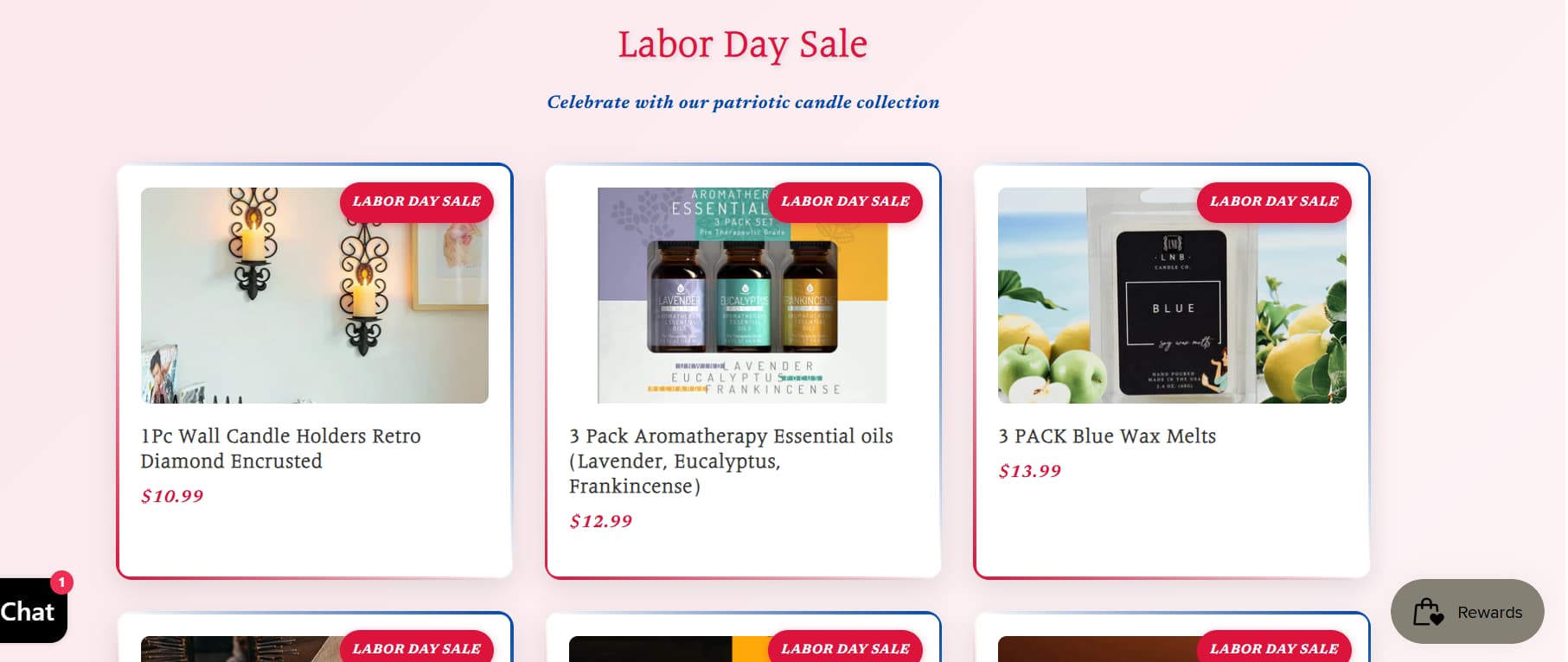
Change the position of Collection ‘Labor Day Sale’.
The Collection ‘Labor Day Sale’ takes up plentiful space on the homepage and I feel quite exhausted to see them all, to tell you the truth. Why not create a new category on the navigation bar and leave a sentence or redirect on the homepage? This can make contents on homepage more simple and explore more about the activities on the store. Also it can be added in your top bar with the underlined link, this may also a good idea. -
Pay more attention to store SEO.
I barely see any SEO progress of your store when searching on Google. From what you said, your store has high traffic from Facebook and social media platforms but no sales. How could customer make the final purchase if they fail to search out your store on famous search engines like Google? I know you have a tight budget, but doing basic SEO won’t cost you too much, unless you would like to explore more in technical SEO or advanced SEO (They two cost a lot indeed). If you fail to hire someone and do the personal SEO, you can also get started with some SEO tools in Shopify APP Store, some of them are very useful like SEOAnt. I suggest you can test SEO Checker and Content Optimization these two features, then you shall know more about what is missing on the store to get more sales. Keep it up and stick to the optimization of your store, you can make it!


Hey @essenceofglow
Lots of traffic but no conversions usually means something small is blocking the sale. It could be product descriptions, shipping costs, or even trust signals like reviews. Try tightening up those areas first. Also, if budget is tight, you could look into affiliate programs (something like UpPromote) since it only costs you when someone actually brings in a sale. That way, you’re not spending upfront.
Best,
Moeed
Test your checkout process as a customer to ensure it’s smooth. Enable guest checkout and multiple payment options in Admin → Settings → Payments. Add essential policy pages (Returns, Privacy) and contact information to build trust.
For app assists:
-
Use Super Trust Badges & Icons to add security badges on product pages for credibility. Full disclosure: I’m on the team behind Super Trust Badges & Icons.
-
Consider Hoppy Free Shipping Bar & Upsell to promote free shipping thresholds and encourage larger orders. Full disclosure: I’m on the team behind Hoppy Free Shipping Bar & Upsell.
If problems continue, share your theme name or any specific error messages for targeted advice.
Traffic with no sales often just means visitors aren’t persuaded to purchase. Check your product photos, descriptions, and prices. Make shipping, returns, and trust signals easy to find. Streamline checkout, test various headlines, and give reviews prominence. Target your ads to warm audiences. Use analytics to monitor visitor behavior to identify points where visitors are dropping out.