Hi guys I’m running into most likely the same issue all beginners have but I wanted to get some feedback. I’ve had this store for over a month with a steady flow of traffic but no sales. Kindly have a look and let me know what you think is off. Appreciate all feedback
Welcome @Hami3 . To be real, I feel that your store is still in early-stage that’s very likely why the traffic is not converting at all. There’s a lot of things for improvement, but I’d like to treat this phase more carefully for the whole website & trust building, not just a product upload exercise.
Right now, the store looks generic: product images, fonts, layout, even your logo all feel default. Shoppers won’t feel any confident buying unless your brand looks as trustworthy as much as possible. For the product pages, I suggest building more trust with high-quality, real-life photos - not those looking you’ve downloaded somewhere or from the manufacturers.

Apart from that, you need REAL trust signals from REAL customers, not over-seeded energy currently appearing on most of your product pages. If your social proof looks artificial, it kills trust and even the legit parts of your store get tainted immediately. And kindly do not undervalue the potential buyers ![]()


Happy selling & good luck!
Hi @Hami3 !
I’m Tracy, from BON Loyalty, an app that helps Shopify merchants build stronger connections with their customers. After carefully browsing your website InUseCo.com and reviewing your store firsthand, I’d like to share some detailed observations about what might be holding back your conversions and some practical ideas on how to fix them from my perspective.
1. Lack of favicon and branding signals
When I first opened your site, I noticed there’s no favicon displayed in the browser tab. While small, this missing detail reduces professional polish and makes it harder for visitors to recognize your brand quickly when they have multiple tabs open. Adding a favicon is a simple fix but helps build trust and brand recall.

2. Homepage’s hero section without clear messaging
Your hero banner is visually clean but lacks a headline or any messaging explaining what your brand offers or the unique value your products bring. This absence means visitors spend extra time guessing what you sell and why they should care. Since attention spans are short, clear, benefit-driven messaging right at the top is crucial to engage customers immediately.
Solution: Add a strong headline summarizing your niche or the main problem you solve, along with a short supporting subheading. For example, if you focus on eco-friendly home goods, the message could be: “Sustainable Essentials for a Healthier Home” with a subline like “Eco-friendly products designed to simplify your everyday life.”

3. Confusing product categories and navigation
As I browsed the menu and product sections, the categories felt inconsistent and didn’t clearly communicate what you specialize in. For example, the top-level navigation is quite sparse, and subcategories are not organized to help customers quickly find what they want. This can overwhelm visitors or lead them to leave because they don’t know where to go.
Solution: Simplify and clarify categories by grouping products logically around customer needs or product types. Consider adding descriptive category names and organizing your navigation bar so customers can intuitively browse. For instance, if you sell multiple eco-friendly products, group them under “Kitchen,” “Cleaning,” or “Lifestyle” to guide customers.
Also, adding a live chat popup can provide instant support to visitors who have questions or uncertainties, preventing potential customers from leaving frustrated.
4. About Us page feels generic
Your About Us page focuses heavily on technology and general concepts that many stores share, but it doesn’t personalize your brand story or connect emotionally with visitors. It misses the chance to explain why your store exists and how your products solve real customer pain points.
Solution: Rewrite the About Us content to highlight your brand mission, values, and how your products improve customers’ lives. Share your story authentically to build trust and connection.

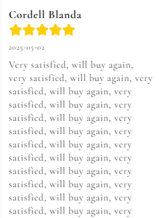
5. Product pages lack real-life context and authentic reviews
Product images are clear but mostly studio-style shots, which don’t help customers imagine how they’d use the products in real life. This reduces emotional appeal and purchase motivation. Similarly, customer reviews exist but feel sparse and lack detailed stories that build social proof.
Solution: Add lifestyle photos or videos showing your products in everyday settings to help customers visualize ownership. Encourage more detailed, authentic reviews by following up with customers post-purchase and asking for feedback and photos.

In summary, the key challenges slowing your sales come down to unclear messaging, confusing navigation, and lack of emotional connection through visuals and storytelling. Fixing these from a customer’s perspective — making it easier to understand what you sell, why it matters, and how to buy, will convert more of your existing traffic into buyers.
I hope these insights help! Wish you all the best for your business. ![]()