Hi @amberscreations ,
I’m Kate from PageFly - Shopify Landing Page Builder.
Congrats on your new store! I totally understand the hardships you are going through at the beginning. From my Conversion Rate Optimization expertise, I would like to give you some advice to make your store more stunning & help you better convert.
1. Homepage
- Make the header menu bar highly visible
I can see you are currently using a hamburger menu bar but it seems hard to find with first visitors of the site. Also, they’re more likely to explore different pages if they can easily access the menu at any point.
Reference:
- Invest more on the hero banner
The hero banner in the homepage is an important touchpoint to impress your customers when they first land on the site. So you should invest more on the hero image and content to attract visitors at the first glance & add a level of professionalism. Also add a Call to action button to guide them what action you want them to take.
Reference:
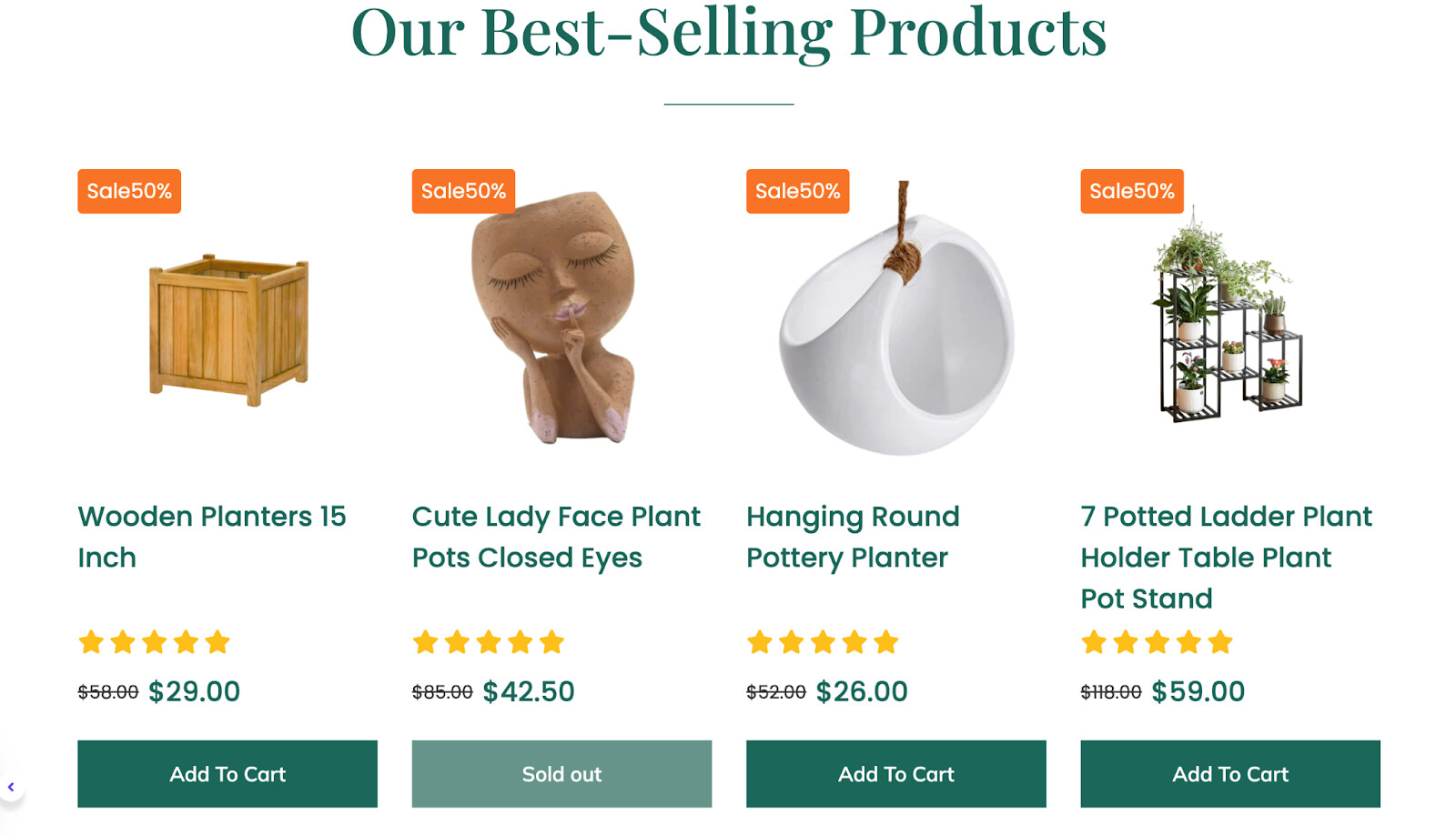
- Improve the first product showcase (styling & product images as your products are unique)
The first product showcase at the homepage is a very important touchpoint as it may decide whether or not visitors explore your products and convert. The styling of your current one needs improving, like highlighting key information and also, consider investing more on product images and each of your products are unique.
Reference:
- Add About Us with key selling points Section
We cater to humanistic shoppers, who will seek out who is BEHIND the product, and why they should buy from you. So consider adding an About Us section to introduce your brand & highlight how you differentiate from other competitors.
Reference:
2. Collection page
Shoppers often visit e-commerce websites with the primary intent of finding and comparing prices. You should set it bold or use another color to make the price information more noticeable.
Reference:
- Add secondary hover on image
You are displaying your products with a single static image. It would be better to use a secondary hover image to showcase your products in lifestyle or unique details/patterns of them, which can increase the likelihood of making a purchase.
3. Product page
Instead of just listing labels of product variants, you can consider using option swatches to showcase different options of the product. Swatches are intuitive and user-friendly which would enhance the shopper experience. Customers can simply click on the swatch that meets their desired option, no need to select options from the drop-down menu.
I understand your store is new, but just a friendly-reminder, don’t forget reviews are essential to the shopping experience. You should add a testimonial section to build trust for your products’ quality. If there are not enough rating stars, consider using text & images to showcase feedback of your first orders.
That’s all of my feedback. Hope it will increase your website’s conversion rate. Feel free to reach me in the reply section if you need further discussions. Wish you luck and endurance on your entrepreneurship journey!
Cheers,
Kate | PageFly Team