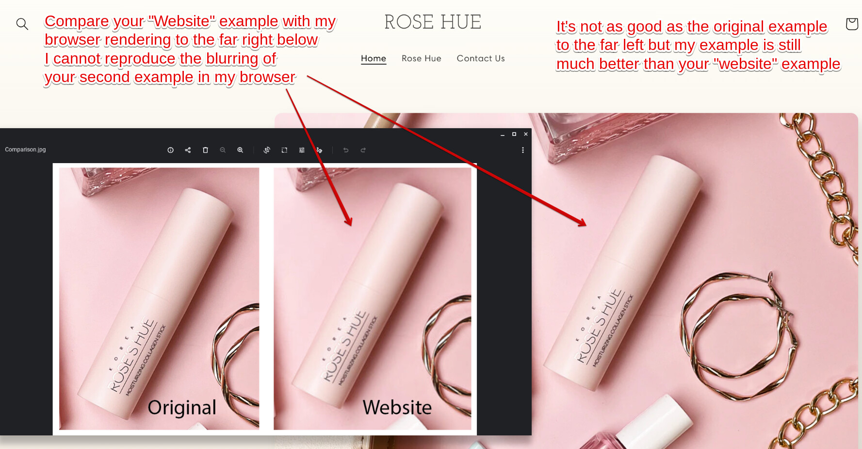
Hey Rhue! @Rhue
As the resolution looks fine on my end even when I blow up the homepage to 200%, the only thing I can recommend is that you can upload images of up to 4472 x 4472 pixels with a file size of up to 20 MB. We typically recommend using 2048 x 2048 pixels for square product photos.
WebP or TIFF file formats?
You could try using the WebP or TIFF file format. WebP is a modern image format that provides superior compression for images on the web, with an average saving of over 30% in file size over traditional file formats like PNG and JPEG. TIFF is a lossless compression format that is widely supported by a range of editing and web applications. It offers high quality resolution, and multiple images and pages can be conveniently saved in a single file. However, the file size tends to be large.
Images with overly large resolutions, of say Shopify’s maximum of 4000 x 4000 pixels, can come out blurry when resized for mobile. So reducing your image to a more manageable size and shape that keeps mobile in mind can help your store look better across all devices. Keep in mind that large files also slow down your site’s loading time. And in ecommerce, and especially in mobile, every second matters, so optimizing your images is a priority.
While Shopify’s responsive designs and algorithms are good at resizing and displaying your images across devices, giving them a hand with thoughtful file sizes can mean an even smoother shopping experience. Use a software called JPEGmini that uses an algorithm to determine the best compression for your image. There is a delicate balance between image quality and optimization, because if you over optimize, it destroys the image.
Resize your image for the container
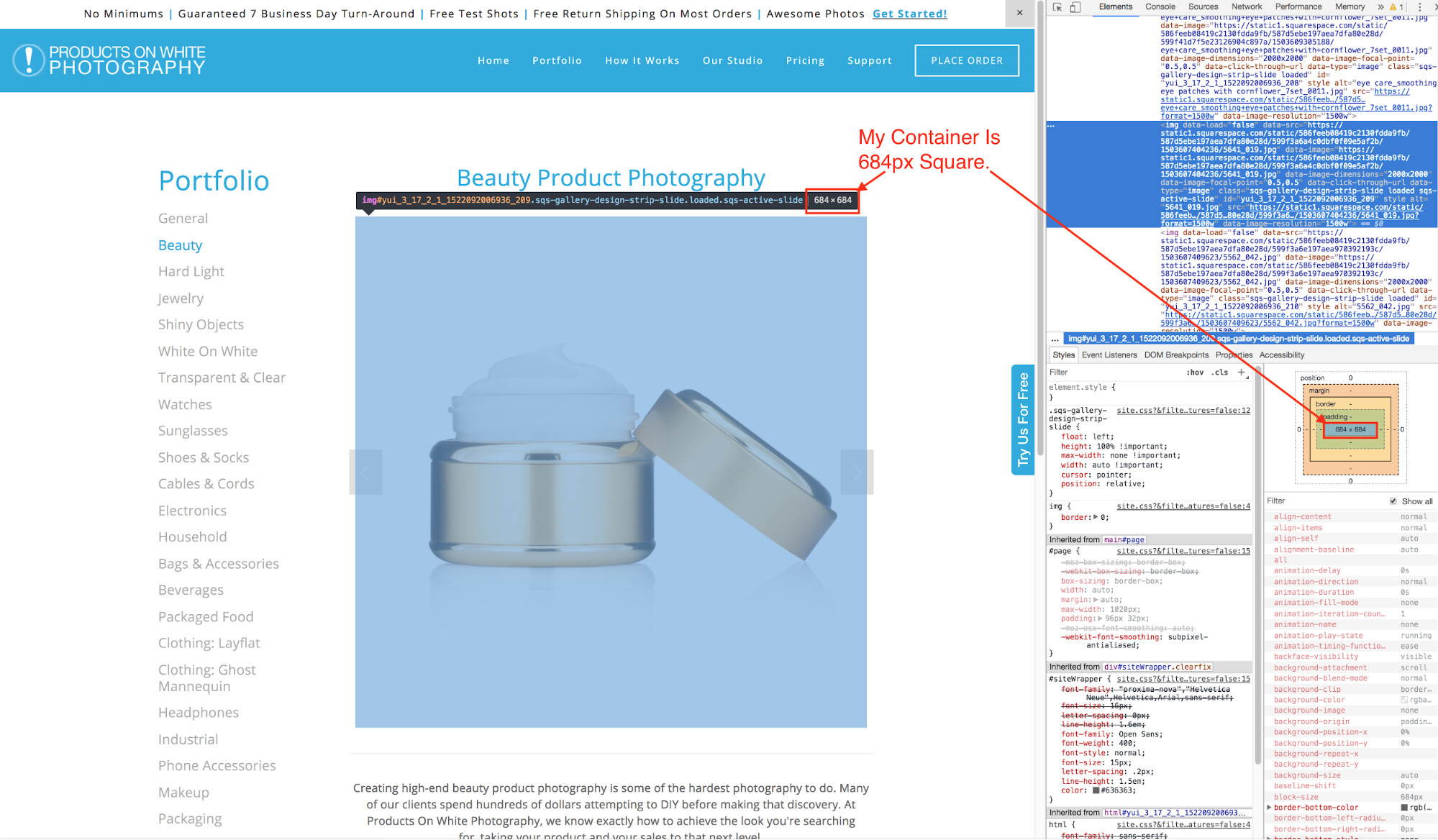
The first way to optimize your image is to resize the height and width of the image. When you look at an image on a webpage you are actually looking at an HTML container with an image dynamically scaled to fit inside it. If the container on the website is a 648 px square and the actual image is 1500 px square, it will be displayed at 648 px, but the image it’s referencing will still load at 1500 px. That’s a lot of extra load time, especially if you have many images.
1. Figure out the HTML container size
You want to resize the actual image to fit the container before you upload it to your website. We usually resize images 1.5x larger than the container so it looks good on a retina screen, which in this example would be 972 px square.
To discover the image container size, you will need to access your web browser’s Developer tools. Right click on the image and choose the Inspect Element. On the sidebar it will show the pixel dimension of the container.
2. Resize the image
There are many free tools to help you resize your image. I recommend using Mac Preview or Microsoft Picture because they’re built in and easy to use.
After you’ve re-sized the image, export it and save it to the desktop as a jpeg at 100%.
3. Compress the image
Once you’ve saved the image at 100% quality in preview, you’ll notice that the file size is actually fairly large. This is because we don’t want Preview to compress the image, because we can’t see the results of moving the jpeg Compression slider. When we compress an image it actually removes data that’s not being used—compress it too much and the image starts to fall apart and it looks blotchy.
So instead, we want to compress the image smartly.


