Hi, I’ve set up a Shopify and would like to know if my store looks trustworthy and are there any design tips that I can do to convert more visitors into customers?
My store is Shipwrecked Studio
Hi, I’ve set up a Shopify and would like to know if my store looks trustworthy and are there any design tips that I can do to convert more visitors into customers?
My store is Shipwrecked Studio
Here are a few reviews, tips and tricks to grow trust that can also increase conversions on your Shopify store:
First Impression & Branding: Colorful, unique logo, and name – awesome! Perhaps you can tighten the homepage that way: push some of those key products or a featured collection upward so that guests can quickly see what you’re selling.
Navigation: The menu is straight-forward (good), but including categories (such as “Apparel,” “Art Prints,” “Accessories”) should make it easier for people to browse, especially as your product line increases.
Product Pages: This is a great shot of your product. Maybe you should have more lifestyle shots, or come in on a part of a model to see some detail. Include approx shipping times and a brief bullet point summary of each item for clarity.
Trust Signals: Include customer reviews (using an app like “Shopify Product Reviews”), trust badges on the cart/checkout page, and perhaps a short “About Us” story (with photos) to create a personal connection.
Conversion Tip: Showcase any limited edition products or free shipping minimums or guarantees. Asking new visitors to sign up for your email list, which can then help convert them, television asking such visitors at least to make a first order, helps too.
So far so good, nice visual, and cute merchandise.
Hi @QaleHardon !
It’s Nick here from BON Loyalty, your trusted partner in customer loyalty solutions for Shopify businesses.
I recently checked out your website, and I must say, it’s really impressive! I love the minimal design and the color palette, which creates a peaceful and homely vibe. However, I have a few suggestions that might help improve your website’s overall performance:
1. Add a Hero Banner to Your Homepage
A hero banner is a visually impactful section at the top of your homepage that typically features an image or video, along with a call-to-action (CTA).
Define the Hero Banner’s Purpose: The hero banner is a great space to showcase your products with high-quality visuals. It can highlight your products’ unique features and grab visitors’ attention right away. You can also use this space to promote special offers or share your brand message to make it more engaging.
Select the Right Visuals:
- Images: Choose a high-quality image or video that reflects your brand and resonates with your target audience.
- Colors: Stick to your brand colors to maintain visual consistency and harmony.
- Fonts: Make sure the text is legible and bold enough to stand out, but not overwhelming.
Craft a Clear and Compelling CTA: Use action-oriented phrases like “Shop Now,” “Explore More,” or “Get Started” to encourage immediate action. Make sure the CTA is prominent and stands out, either through contrasting colors or a clickable button.
2. Display Contact Information Clearly
Ensure your contact details (phone number, email, physical address) are easy to find on your website, either in the header or on a dedicated contact page. This builds trust with visitors and makes it easy for them to reach out if they need assistance.
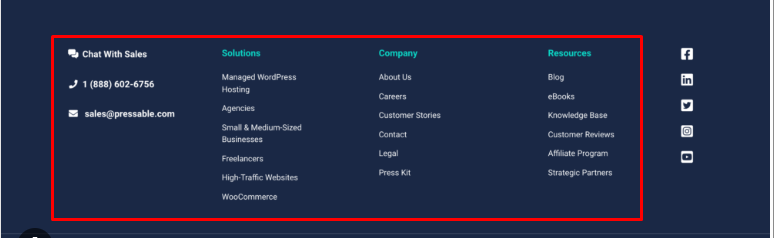
3. Add a Footer to Your Website
A footer is an essential part of any website, as it serves as a place to display important information and navigation links.
Provides Key Information: A footer typically includes your contact details, company address, privacy policy, terms of service, and social media links.
Improves Navigation: It helps visitors easily navigate to important pages, especially on longer websites where they may not want to scroll back to the top.
Boosts Credibility: A well-organized footer adds professionalism to your website, reassuring visitors that you’re a legitimate business.
I hope these suggestions help enhance your website’s trustworthiness and user experience. Wishing you all the best with your site, and feel free to reach out if you need further assistance!
Hey there! I just took a look at your store, you’ve done a great job so far! The overall vibe is truly creative and visually engaging, which helps establish trust from the very first impression. That said, here are a few tips that could help improve trust even more and possibly boost your conversions:
People love to know who’s behind the brand. Sharing your story, passion, or inspiration behind Shipwrecked Studio can help build an emotional connection with visitors.
Highlight customer trust signals:
If you have any reviews, testimonials, or even user-generated content (like tagged photos), definitely showcase them. Social proof goes a long way in building credibility.
Tweak the product descriptions:
Make sure they clearly explain the benefits and use cases of your products, not just the features. A conversational tone also makes it feel more personal and less like a catalog.
Improve navigation & clarity:
Make sure it’s super easy to find your products, contact info, shipping/return policy, etc. People tend to leave fast if they can’t quickly find what they’re looking for.
Speed & mobile optimization:
Your store loads fine for me, but make sure it’s optimized for mobile users that’s where a big chunk of traffic comes from. A slow or clunky mobile experience can hurt conversions.
Add a trust badge or secure checkout note:
Even a small “Secure Checkout — Powered by Shopify” note near the cart or footer can reassure visitors.
Overall, you’re definitely on the right track. Keep refining bit by bit, and you’ll start seeing those conversions grow. Wishing you all the best with your store!
my quick thoughts: get a dot com domain as people trust them a lot more. give to many customers for review and get a ton of reviews. show off the reviews and do marketing and run ads.
At least you understood that the store needs to be trustable even if you deserve to be trusted.
Let’s talk about the silent killer of your sales:
![]() Only ~3% of your traffic converts. That means 97% leave without buying.
Only ~3% of your traffic converts. That means 97% leave without buying.
Most of us focus on ads, influencers, or discounts — but ignore the actual customer experience on our store. Here are some things that drive people away (and you might not even notice):
The good news? These are fixable.
There’s a tool called Scancx that scans your store like a mystery shopper and shows what might be pushing your visitors away. It helped me catch things I totally missed.
![]() Fix the trust issues → boost conversions.
Fix the trust issues → boost conversions.
If you’re wondering why sales aren’t matching your traffic, maybe it’s time to scan before you spend more on ads.
Hi @QaleHardon ,
Congrats on launching your store. it’s a great first step, and I love the creativity behind Shipwrecked Studio!
I had a quick look, and here are a few practical tips to make your store feel more trustworthy and conversion-ready:
1. Add more social proof
Right now I don’t see reviews or testimonials, even a few customer quotes or product reviews can go a long way to reassure new visitors. You can use apps to automate this or even start with feedback from friends who’ve tried your products.
2. Build confidence post-purchase too
A lot of trust is lost after someone checks out, if they’re left wondering “where’s my order?” or how to make a return, they may not come back.
You might consider tools like:
Both can help build a more professional, polished impression and save you time answering “where is it?” emails too.
3. Make sure key policies are easy to find
Consider adding links to your return policy, contact info, and shipping timeframes in your footer or product pages. Even a basic FAQ page can boost trust significantly.
Let me know if this helps!
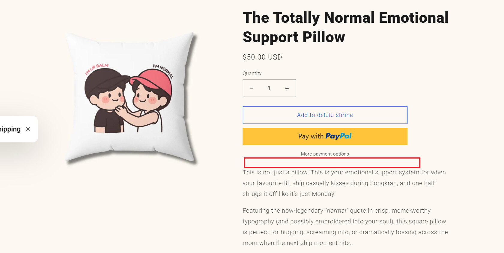
Hi @QaleHardon
I really like your products and the unique vibe of your entire store… I think customers will definitely feel that too.
One thing I’d suggest is to highlight the key features or benefits a bit more clearly. You could add small icons next to each one to make them stand out — like in the image below.
This is an example of how your product page could look when you add TrustMark app.
You can simply adjust the text and colors to match your style.
Hope this helps! ![]()
Cheers,
Nemanja
Hi @QaleHardon
You can consider adding some badges to describe your products like 100% machine washable or Handmade under More payment options icon. It can build up some trust on your website and for your users meanwhile, a kind reminder here.
Hi @QaleHardon ,
I looked at your store briefly, its look impressive and good. And while I have gone through your store, I observed some improvements to be done which can help you design up-to the mark.
Consider these improvements…
1.To improve customer experience and build trust, consider adding a newsletter signup, contact information, and social media links to your site at footer.
2.Displaying customer reviews through a reviews app can also increase conversions by showing real feedback. you can approach trusted review apps like ShopReviews-ShopReviews ‑ Product Reviews - ShopReviews - Boost your sales with product reviews | Shopify App Store
3.Mobile responsiveness matters—optimize large images and ensure your fonts and buttons adapt smoothly across all devices.
And if you also sell same products in Etsy. you can consider integration apps like (Etsy Integration - ShopList: Etsy Integration ‑ ShopList - ShopList - seamless integration between Shopify and Etsy | Shopify App Store) which make users to reduce manual work—features like real-time orders syncing, real-time products syncing , product mapping, and bulk listing can save hours and easy to selling process.
Thanks.
Waytoapps.
I’m not here to recommend any products, I just want to share my honest thoughts.
Hello @QaleHardon To improve your store’s trustworthiness appearance, there are 2 major things to check on. The first is there has to be a section for customer reviews or testimonials as the case may be. The second is that there should be links to the social media accounts of the business. If you include these two things, your store would look ten times more authentic than it does right now.