Hi! I’m running my store from month and got only 1 conversion. Usually I have 10-30 visits per day. How to improve?
My store name: sweetvictoria.pl/en
Hi! I’m running my store from month and got only 1 conversion. Usually I have 10-30 visits per day. How to improve?
My store name: sweetvictoria.pl/en
The site looks ok. And the prices are not that high.
Well, in general, you have done some solid work, but some things are just off for me.
First, a disproportion of heading and body font, plus large images, makes a lot of important text almost blurred out. As 12px is too small and is not readable. Maybe you have perfect vision, but note that you should present that information as clearly as possible. And your store should tell some story, as every word can bring you closer t customer, connect somehow. But even with larger text, you would need more text to reassure customers.
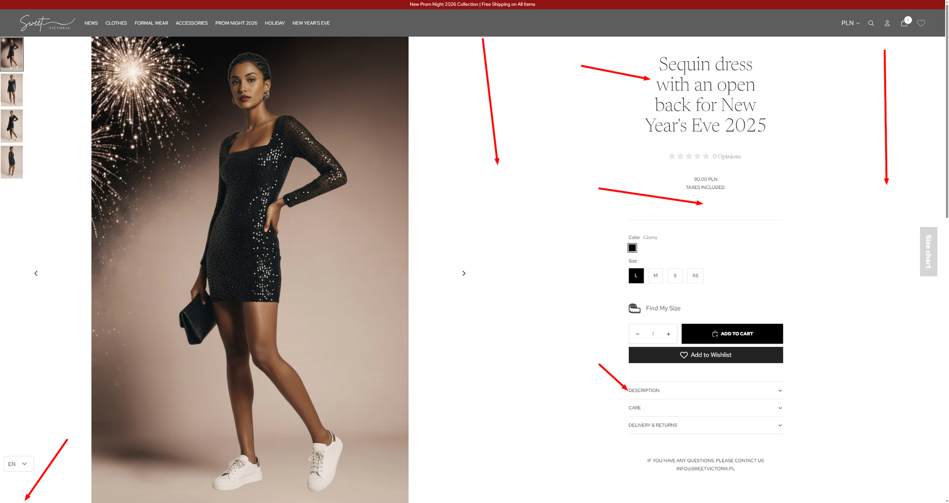
Second, your images are hit and miss; some are good, but some, like the hero banner, are not a great choice. Hero banner first takes too much space, but also the image is not of the best quality and looks a bit pixelated. Also, some product images look like you added soem AI generated background, it does not look good )for example, “Sequin dress with an open back for New Year’s Eve 2025”)
Third, trust signals. There are some but some are missing. For me, I first check the Contact information page, About us, and policies. And first you do not havecontact info page, but you have the main info email on several pages. That is Ok but not near enough, you are missing business name, address, telephone, maybe VAT/Tax or business registration number. When you are shopping, is it enough for a store to just have an email? Enough to leave your credit card and personal information? Plus, you have “alice198828” Gmail in one page, probably forgot to change to main if not, but still.
And some more details on the product page. It may look OK on regular screens or notebooks, but on smaller and wider screens and get get some issues. See the screenshot, a lot of empty space, disconnected elements. The title is too narrow and even if size is fine it gets in 4 rows, which is not ideal. THen price is too small, almost not noticable and again some space. Thumbnails are too far away from amin image, and Imention that this image looks like bad Photoshop. Arrow on the bottom left is for “try on yourself”, which is a great feature and customers will love that. But on your page is all the way to the left, not visible at first, and easily missed as customers’ eyes focus on product info on the right. You could put the 3 best features just after the price, or open first accordion (dscription, so some info is visible straight away). AS you have sccessories you can always put additional product next to that dress, as bundle or just "It goes with’ “complete the look” type of titles.
Good luck, you have some work to do but also a good base to work from.
Congratulations, you have a nice website. I recommend that you make description accordion open by default.
And then optimize your ads based on previous visitors and purchases.
I also cannot see that you have a program to capture visitors’ email addresses to run an email marketing campaign.
Best regards,
Dan from Ryviu: Product Reviews App
Hey @sweetvictoria
Your store looks genuinely good and the product images are strong. A month in with 10-30 visits daily and only one conversion means you need more traffic, but also better conversion optimization. Let me focus on what you can control immediately.
Your cart has a slider setup, which is solid, but you’re not maximizing it. Add a progress bar showing how close people are to free shipping or a discount. When someone sees they’re close to hitting that threshold, they’ll add another item. This is especially effective for the products you’re selling where people often want multiple pieces.
Show complementary products in that cart. Help people see what else pairs well with what they just added. This increases your average order value and gives visitors more reasons to buy.
Create product bundles. Looking at what you sell, there are natural combinations that make sense together. Bundle them at a slight discount and you’ll increase conversions while boosting order value. People love feeling like they’re getting a deal, and bundles simplify decision-making.
Don’t install separate apps for cart features and bundling. Something like iCart handles all your cart customization like upsells, cross-sells, progress bar, bundles, and more in one place, keeps costs down and your store running smoothly.
The bigger issue is traffic. 10-30 visits daily isn’t enough volume to reliably convert, even with a well-optimized store. Focus hard on SEO to build organic traffic. Work on content marketing, social media presence, or consider strategic paid advertising if budget allows. You need more eyeballs before conversion rate optimization really matters.
Your foundation is good. Now scale the traffic while optimizing that cart experience, and you’ll start seeing consistent sales.
With 10–30 daily visits, the traffic itself isn’t the main issue—it’s more likely a conversion trust or clarity gap. I’d start by checking product pages: are benefits clear above the fold, is pricing transparent, and do you have visible social proof (reviews, guarantees, shipping/returns info)? Also curious where is most of your traffic coming from (ads, social, organic)? That usually makes a big difference in what to optimize next.
With that level of traffic, the issue is usually not traffic but clarity on the page.
I’d quickly check:
Is it immediately clear what the product is and who it’s for?
Are trust elements (shipping, returns, payment) visible?
Where is the traffic coming from?
Improving these basics often helps more than increasing traffic at this stage.
Hi! First of all, I know how frustrating this feels, low traffic + almost no conversions can be really discouraging.
Here are a few concrete things you could improve:
Navigation bar color: the gray top bar doesn’t really match your brown/white brand colors. A white navigation bar would feel cleaner and more premium.
Main titles: your headings are a bit too small. Make them bigger and more visible so visitors immediately understand what you’re selling.
Product pages: there’s not enough information to convince someone to buy. Add more details, benefits, and reasons why your product is worth it.
Homepage messaging: explain clearly who your brand is for and what makes it different. Right now, it’s hard to understand why someone should choose your brand over others.
Welcome discount: the accessories welcome code is a good idea, but it’s not highlighted enough. You could make it more visible (for example with a popup or a banner) so it really feels like a special offer.
Hope this helps, and good luck, you’re on the right track
I’ve used Google Ads, Facebook Ads, and social media till now. Occasionally I keep messaging to people who might be interested in. Does my store products seem to be good pick or not really?
People are visiting the store, but the website is not yet doing the job of a salesperson. It looks good, but it does not clearly guide visitors, build enough trust, or give them a strong reason to buy now. With a few strategic changes, the same traffic can convert much better.
Your site is in English but you do not have a currency selector for GBP. It is also not clear how much shipping from Poland to the UK would be.
As a start-up you will need well in excess of 100 visits a day before you will any sales - i.e. a conversion rate of 1%. Once you become more established you should expect to see a conversion rate around 3-5%.
Don’t believe the hype ![]()
Happy New Year! @sweetvictoria here are some tips I have on how it could be improved
Add a high quality short video on the homepage displaying some of the products
Provide more categories for the clothing like “editor’s choice” and “market’s trendiest”
Put in some FAQs on the homepage to answer some well thought out questions.
Hey @sweetvictoria , thanks for sharing, and trust me, you’re not alone. Getting traffic but no conversions can be really frustrating, especially early on. But it’s good that you’re already tracking this stuff, it means you’re paying attention to what matters.
I had a quick look at your site. First impressions: the aesthetic is nice and clean, but here are a few things you might want to check or tweak:
Is it clear right away what your product is and who it’s for? If people are landing on your homepage and leaving quickly, it might be a clarity issue more than a traffic one.
Things like product reviews, shipping & return info, or even just a personal brand story can go a long way in helping new visitors feel confident enough to buy.
If they don’t convert on the first visit (most won’t), you need a plan to bring them back.
That’s where a loyalty or referral setup can help. I work with TrustWILL Loyalty & Referrals, it lets you reward customers for signing up, making their first purchase, referring a friend, etc. You can also offer perks like free shipping or points on repeat purchases, which is great for building momentum once your first few orders come in.
You don’t need to throw everything at the wall right away, but having a system to turn one-time visitors into repeat buyers makes a big difference over time.
Let me know any feedback needed on a specific page or product. Happy to help however I can.
Hope this helps a bit!
If it does, feel free to mark it as a solution so others can find it too ![]()
Hi, @sweetvictoria
With 10-30 visits/day, getting only 1 conversion at this stage isn’t unusual-but it does point to a speed + conversion + trust gap rather than a traffic issue.
Here’s what I’d focus on first:
I checked your site using the PageSpeed Report - your mobile LCP is around 15s, which is quite slow. Many visitors will leave before the page fully loads.
Until this improves, pushing more traffic probably won’t help much.
I’d start with speed first, then work on trust and product pages to increase the conversions.
For speed optimization, tools like Website Speedy can make things easier, especially for images and scripts.
Disclaimer: I’m affiliated with the Website Speedy.
10-30 visits a day is honestly too small a sample to draw real conclusions from. at that volume, one conversion could mean a 3% rate one week and 0% the next just from random variation. you need at least a few hundred sessions to see patterns.
that said, the things worth checking at any volume: is your product page answering “why should i buy this here instead of somewhere else?” if the answer isn’t obvious within 5 seconds of landing, that’s your problem. also check where those 10-30 visitors are coming from because if it’s all random Google traffic that doesn’t match your product, no amount of page optimization will help.
With 10-30 visits per day and 1 conversion, it is typically not a traffic volume problem but rather a product page intent/clarity problem. First, look at where the traffic is coming from. If the majority of traffic is coming from social or general users, these visitors may just be curious but not buyers. That can be enough to keep conversion low.
Then, go through your best- selling product pages. As a general rule the first image, headline and price on each page should immediately convey why it’s worth the time of your customers. Include your trust factors like delivery time, returns, and reviews in the top fold.
And make the navigation simple so users can get to a product in two clicks, three, at most.