Hello,
Please review my brand. www.peachyaccessories.com. Be brutally honest.
A new jewelry store owner seeks feedback on peachyaccessories.com, requesting brutally honest reviews. The store sells gold-plated accessories with 228 products and has recently launched.
Design & Visual Issues:
Missing Trust Elements:
Technical Performance:
Conversion Optimization Gaps:
Positive Elements:
Multiple commenters recommend specific apps for bundles, live chat, speed optimization, and loyalty programs to address these gaps.
Hello,
Please review my brand. www.peachyaccessories.com. Be brutally honest.
I took a detailed look at www.peachyaccessories.com and here’s a brutally honest, constructive review to give you elevate your brand and boost sales:
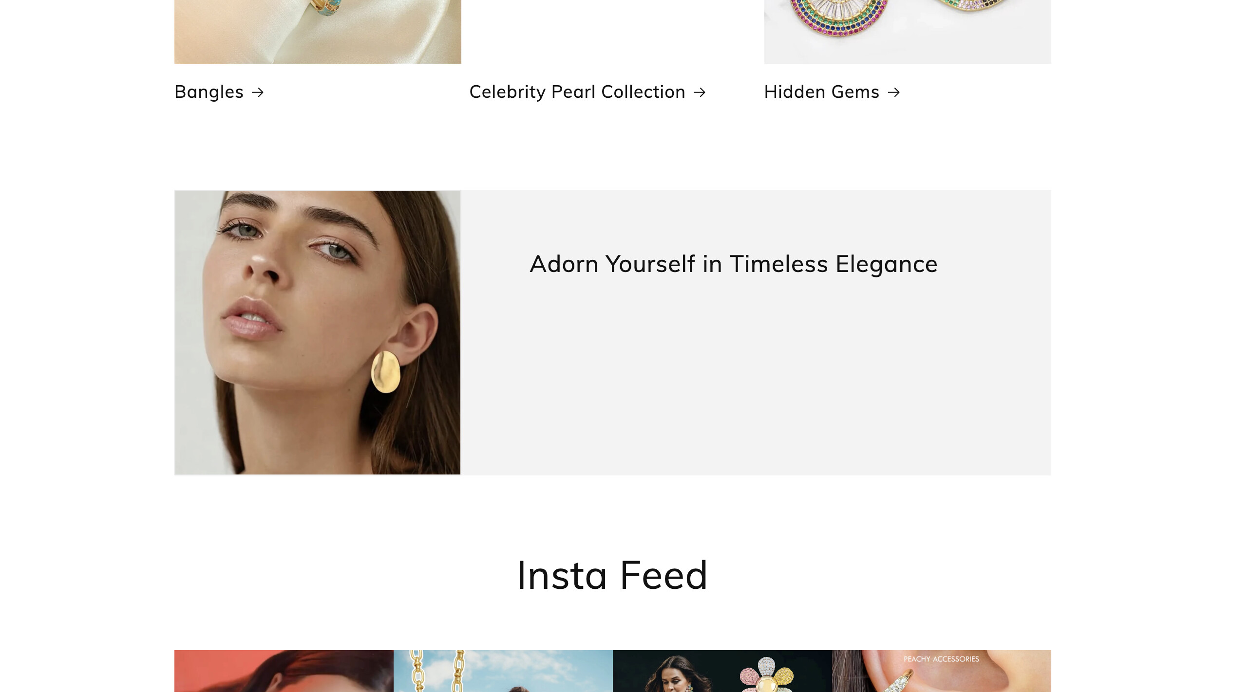
High-Quality Product Photography: Your product images are clear, well-lit, and styled nicely, which helps showcase your products’ details.
Simple Navigation: The menu is straightforward, making it easy for visitors to find product categories.
Mobile Friendly: The site adapts well on mobile devices, which is crucial since many shoppers browse on phones.
Trust badges, secure checkout icons, and clear return/refund policies are not prominent.
Action: Add a review app like Judge.me or Shopify Product Reviews and encourage early buyers to leave feedback. Highlight your return policy and payment security badges near CTAs.
There’s little sense of urgency or incentive (e.g., limited stock, free shipping thresholds, or time-limited discounts).
Action: Use action-oriented copy (“Get yours now”, “Limited stock available”) and consider adding countdown timers or free shipping offers to drive urgency.
I recommend installing the BiDeal Bundle Volume Discounts app on Shopify. It allows you to:
Create attractive product bundles and volume discounts easily.
Encourage customers to buy more with mix-and-match offers.
Display discount progress bars to motivate larger purchases.
Seamlessly integrate with your theme and checkout.
This can help Peachy Accessories increase sales and average order value without complicated setup.
There kind of lot to be done, did you just live your store ? @sarangab1919
yes.
Alright, not too bad, but here’s my honest take and what could make your store more professional and keep customers coming to shop and trust your store
Add a clear value statement or unique selling point on the homepage so visitors immediately know why they should buy from you.
Include customer reviews or testimonials to build trust and social proof.
Feature your best-selling or new products right on the homepage to guide visitors faster to buying decisions.
Improve product images by using sharper, lifestyle-focused photos to better showcase your items.
Optimize your site speed, especially on mobile, by compressing images and minimizing heavy elements.
And if you could afford buying a premium theme, it will definitely boost your store look and functionality, with the right approach and setup, you’ll scale easily with your store
Hi @sarangab1919 ,
Thanks for reaching out to the community. We are MooseDesk, a comprehensive Live Chat, FAQ & Helpdesk Appdesigned to elevate your customer support experience ![]()
First off all, huge congratulations on your store launch ![]() The website is visually appealing, featuring a clean layout, detailed product descriptions, and lifestyle imagery. That said, there’s one key element still missing that could significantly impact both your conversion rate and customer experience:
The website is visually appealing, featuring a clean layout, detailed product descriptions, and lifestyle imagery. That said, there’s one key element still missing that could significantly impact both your conversion rate and customer experience:
Currently I can see your website lack of an essential support tool that can help customer get answers fast. It’s essential to provide customers with a helpful support tool that allows them to quickly chat with your support team, easily track orders, and find answers to common questions on their own .
I suggest exploring MooseDesk, a free Live Chat, FAQ & Helpdesk App. MooseDesk provides auto-reply features during non-business hours, a proactive help center, and a user-friendly widget layout, offering an effective solution to enhance customer support on your platform. Moreover, you can easily customize your widget that match brand style
Your store looks great overall! To make it even better, you could consider adding an FAQ and a “Contact Us” page. These are essential for helping customers quickly find answers or reach out for support, which can significantly enhance their shopping experience.
For an easy solution, I recommend trying MooseDesk App. It provides free, professionally designed FAQ and Contact Us templates with a simple one-click setup that perfect for elevating your store effortlessly!
A FAQ page to handle repeat questions (shipping, returns, care instructions, etc.)
A Contact Us page with a proper form (instead of just an email link)
This makes your store look more professional, builds trust, and clears obstacles to buying — especially for first-time visitors
————————————
As an expert/enthusiast in UX, I recommend implementing these changes to improve customer experience when scrolling through your store.
If this is helpful for you, please let me know by giving me a ‘LIKE’. If your question is answered please mark this as 'SOLUTION’.
Hi there! Ian here from Fast Bundle.
Firstly I believe you can make the homepage better by moving the texts to left or right instead of writing on the picture itself. Another idea would be to fit the picture to the whole screen and write with different color on it. The blank space on the sides of the screen does not really make a good impression.
Everything else seems pretty well and wow! You’ve got very nice products and images of them are very eye catching ![]()
Just for selling more I can recommend adding some add-ons, mix and matches or upselling offers for the products you believe must be bought together.
Wish you all the beast ahead with great sales ![]()
Hello @sarangab1919 , thanks for sharing your website. I reviewed www.peachyaccessories.com and ran it through Google PageSpeed Insights. Honestly, your LCP (Largest Contentful Paint), FCP (First Contentful Paint), and CLS (Cumulative Layout Shift) scores are quite poor, which means your site’s loading speed and visual stability need serious improvement.
Here are some actionable ways to improve your site performance:
Minimize main-thread work: Avoid heavy JavaScript blocking your page rendering. Use the defer attribute on scripts to load them after main content.
Defer or async non-essential Javascript: Move non-critical scripts to load later so they don’t slow down initial page load.
Minimize layout thrashing: Avoid repeated style or layout recalculations caused by JavaScript (e.g., reading/writing DOM properties in loops).
Reduce third-party app impact: Too many apps inject scripts and styles that bloat your page. Audit installed apps and remove or replace inefficient ones.
Properly size images: Use responsive images with srcset and explicit width and height attributes to reduce layout shifts and speed up rendering.
Here is an example of responsive image markup you can use:
<img
src=“{{ product.featured_image | img_url: ‘300x300’ }}”
srcset="
{{ product.featured_image | img_url: ‘300x300’ }} 300w,
{{ product.featured_image | img_url: ‘600x600’ }} 600w,
{{ product.featured_image | img_url: ‘900x900’ }} 900w"
sizes=“(max-width: 600px) 300px, (max-width: 900px) 600px, 900px”
alt=“{{ product.title }}”
width=“600”
height=“600”
loading=“lazy”
/>
Alternatively, if you want a quicker fix without coding, I recommend trying Website Speedy — a Shopify app that automatically optimizes images, defers scripts, and improves your Core Web Vitals scores. It’s easy to install and offers a 14-day free trial.
(Disclaimer : we are the developers of this app happy to answer any questions)
Hi, I’m Wayne from Akohub. We have been working with many brands to run online stores. After viewing your website, I believe our expertise could add value to your business.
The image at the hero section is blur, I would suggest to add a better quality image since here section is the first impression when a customer visit your store.
This part do not have a clear CTA, I would recommend replace this part with your brand story or more information to showcase the craftsmanship and detail around your products. This can foster a higher intention for customers to place an order.
Your store is missing a loyalty widget currently. I would recommend adding one since loyalty programs are effective to attract fashion lovers to come back to your brand and foster a sense of community around your brand. When customers know they can earn points or benefits for shopping and sharing your store with friends, they’re more likely to return and spread the word. This not only increases the chances of repeat business but also boosts your customer lifetime value, making your business more sustainable in the long run. To streamline the setting process, you can check out our Ako Marketing App, which is designed to make setting up retargeting campaigns and loyalty programs much easier.
Best wishes! If you have any more questions or any questions about the loyalty program, feel free to let us know! We are willing to offer a free professional consultation. Don’t forget to like and mark it as a solution if you find this helpful. Thanks.
Hello @sarangab1919 !
Thank you for sharing your business with us. I hope my feedback and suggestions will help your store become even better.
1. Homepage Overview
For the hero banner, prioritize showcasing product-related information (e.g., latest collection, bestsellers) or promotional offers, paired with a clear CTA button to guide customers to product pages.
2. Trust Signals and Customer Testimonials
3. Product Arrangement
4. Navigation
I hope these suggestions can improve your online store. Wish you all the best for your business!
Your jewelry store shows good potential with quality product photography and a clear brand aesthetic. The Instagram feed integration and customer testimonials add social proof effectively.
Professional product photography, clean navigation, and good use of social media integration. The “More Than Jewelry—A Statement” messaging creates emotional connection, and customer reviews build trust.
Product Organization Issues: You have many individual listings for similar items (multiple heart earrings, various necklaces) that should be grouped together. This makes browsing feel cluttered and unprofessional compared to established jewelry brands.
Limited Visual Options: For jewelry pieces available in different metals/finishes, customers can’t easily compare options without clicking through separate product pages.
Design Refinement Needed: While functional, the overall design lacks the premium feel expected for jewelry retail. The layout and typography could be more sophisticated to match jewelry industry standards.
Missing Trust Elements: No visible security badges, return policy prominence, or sizing guides that jewelry customers expect.
G: Combined Listings & Variant would group related jewelry pieces into single listings with metal/style options, creating a cleaner, more professional catalog that matches how customers expect to shop for jewelry.
Tapita: AI Theme Section Store could help elevate your store design with premium jewelry-focused sections, trust badges, and more sophisticated layouts - completely free.
Tapita: SEO Optimizer & Speed would ensure fast loading times and better search rankings for jewelry-related keywords.
The foundation is there - these changes would create a more premium, trustworthy jewelry shopping experience.
Tapita Experts
Peachy Accessories presents as a gold-plated jewelry / fashion accessories site with a wide catalog (228 products) and a clean, categorized layout. The site has many good elements already. To strengthen performance and conversion, here are my thoughts:
1. Build Immediate Trust & Credibility
You display 14 reviews already in a “Let customers speak for us” section, which is great. But I’d move reviews closer to each product page (star ratings, comments) to reassure buyers right where they decide. PEACHY ACCESSORIES+2PEACHY ACCESSORIES+2
The “Our Story” page shares your brand origin, which is helpful. Consider highlighting that story in a banner on the homepage to bring emotional connection front and center. PEACHY ACCESSORIES
Customer reviews are visible but not very detailed—real photos, dates, or more personal reviews would reassure buyers.Customers are more likely to purchase when they trust the store. You should add product reviews using a tool like ShopReviews ‑ Product Reviews - ShopReviews - Boost your sales with product reviews | Shopify App Store, which makes collecting and displaying real customer feedback seamless.
Add trust badges (secure checkout, quality guarantee, anti-tarnish, etc.) near the “Add to Cart” buttons to reduce hesitation.
2. Hero / First Impression & Storytelling
Right now, homepage shows promotions like “Free Shipping on prepaid above Rs 2000 & 10% off on orders above Rs 5000” and then product listings. Those are important, but a stronger hero message could anchor the visitor—something like: “Gold-Plated Jewelry That Lasts | Shop Today” with a bold CTA.
A seasonal or featured highlight (“Best Sellers”, “New Arrivals”, “Limited Edition”) near the banner would give direction to new visitors.
3. Product Navigation & Discovery
You have well-structured categories (Necklace, Rings, Bracelets, etc.). PEACHY ACCESSORIES+1
The “All Products / Filter & Sort” page shows filters and sorting options (in-stock, price) which is good. PEACHY ACCESSORIES
However, filters could be stronger—e.g. by plating type, gemstone, price bandwidth, or popularity. This helps users narrow choices more precisely.
4. Product Pages & Conversion Helpers
Many items are marked “Sale”, which is good, but ensure that the discount logic is clear and not confusing (i.e. show original price and discounted price cleanly). PEACHY ACCESSORIES+1
For products that are out of stock, ensure the “Sold Out” label is clear and consider allowing “Notify me when back in stock” option.
Show key selling points (e.g. “Water Resistant”, “Anti-Tarnish”, “18K Gold Plated”) near product listings or CTAs to reinforce value.
Use lifestyle images—people wearing the jewelry in real settings—to help customers visualize how pieces look in use.
5. Consistency & Conversion Nudges
The rewards/member benefit banner is good (“Become a PEACHY ACCESSORIES Rewards member to get points & exclusive benefits”). Use that more prominently or as a sticky / recurring CTA. PEACHY ACCESSORIES
Already have free shipping and discount thresholds; make sure those are always visible near cart and CTAs to remind users as they browse.
Add urgency cues like “Only X items left” or “Limited time sale” to motivate faster decisions.
Test a popup or banner for first-time visitor incentive (e.g. “10% off your first order when you subscribe”) to capture email leads.
If you’re also selling on Etsy, consider using an app like Etsy Integration ‑ ShopList - ShopList - seamless integration between Shopify and Etsy | Shopify App Store . It lets you sync your products and orders between Shopify and Etsy automatically, saving time and helping you manage inventory more efficiently—perfect for handmade or customized products like yours.
Best Regards,
Waytoapps
Hey @sarangab1919
The key area is the cart experience. Most jewelry stores benefit from having a slide cart drawer. This allows you to show product bundles, upsells, and cross-sells directly in the cart, which encourages customers to add matching pieces or complete sets before checking out. You can also include a progress bar showing how close they are to free shipping or discounts, which nudges customers to spend a little more.
Some of your products could also be offered as bundles, for example, matching necklaces and earrings or rings with bracelets, which naturally increases the average order value. On the SEO side, even basic things like meta titles, descriptions, and headings need attention to help people find your store more easily.
Instead of adding separate apps for each upsell or cart feature, an all-in-one solution like iCart can make it easy to handle upsells, cross-sells, product bundles, and progress bars all in one place.
Focusing on these areas should make your store feel more polished, intuitive, and ultimately help turn visitors into buyers. Your jewelry and pricing look good, but improving navigation and cart experience could make a big difference in sales.